Who are the top 100 UK law firms 2018?
Monday 8th January 2018

The following information has been gathered by taking screenshots of the top 100 UK law firm’s websites in order to assess digital trends that are present in the leading UK law firms website home pages.
Please note, this is a research piece. Not all of the top 100 UK law firm’s websites have been designed and developed by Tela. The screenshots of each website were taken in April 2018.
So who are the top 100 UK Law Firms in 2018? The original list of the top 100 UK law firms was compiled by The Lawyer based on the revenue of each firm, while the additional information featured in the table below was collected from each of the law firm’s websites. Any information that could not be found on the top 100 UK law firm’s websites has been left blank in the table.
| Rank | Law firm | Revenue (£m) | Offices | Countries | Partners | Employees |
|---|---|---|---|---|---|---|
| 1 | DLA Piper | 1,675.20 | 130 | 40 | 1632 | 4145 |
| 2 | Clifford Chance | 1,540.00 | 33 | 24 | 572 | |
| 3 | Allen & Overy | 1,520.00 | 44 | 31 | 554 | 5400 |
| 4 | Linklaters | 1,438.40 | 29 | 20 | 470 | 5270 |
| 5 | Hogan Lovells | 1,420.00 | 44 | 22 | 884 | |
| 6 | Freshfields Bruckhaus Deringer | 1,330.00 | 38 | 37 | 418 | |
| 7 | Norton Rose Fulbright | 1,243.30 | 62 | 36 | >1200 | |
| 8 | Herbert Smith Freehills | 920.50 | 27 | 19 | ||
| 9 | CMS | 817.60 | 74 | 42 | >1000 | 7500 |
| 10 | Ashurst | 541.00 | 25 | 15 | 380 | |
| 11 | Clyde & Co | 508.10 | 52 | 25 | 390 | 3600 |
| 12 | Slaughter and May | 468.00 | 4 | 3 | 115 | |
| 13 | Eversheds | 438.60 | 66 | 32 | >700 | |
| 14 | Pinsent Masons | 423.10 | 25 | 11 | 433 | |
| 15 | Gowling WLG | 390.10 | 17 | 8 | 738 | |
| 16 | Simmons & Simmons | 316.10 | 18 | 15 | 306 | |
| 17 | Bird & Bird | 303.20 | 28 | 18 | ||
| 18 | Berwin Leighton Paisner – Merged | 272.00 | ||||
| 19 | Taylor Wessing | 269.80 | 32 | 19 | >400 | |
| 20 | Irwin Mitchell | 235.20 | 14 | 1 | >300 | 2490 |
| 21 | Osborne Clarke | 209.00 | 25 | 12 | 250 | |
| 22 | DAC Beachcroft | 207.00 | 32 | 15 | 252 | 2300 |
| 23 | DWF | 201.20 | 30 | 15 | 2700 | |
| 24 | Addleshaw Goddard | 197.80 | 11 | 6 | 240 | |
| 25 | Stephenson Harwood | 176.40 | 13 | 9 | 140 | 900 |
| 26 | Withers | 174.50 | 16 | 10 | 160 | 1000 |
| 27 | Macfarlanes | 167.60 | 2 | 2 | 86 | |
| 28 | Holman Fenwick Willian | 165.70 | 18 | 15 | 170 | |
| 29 | Fieldfisher | 165.00 | 19 | 13 | 221 | 1000 |
| 30 | Watson Farley & Williams | 159.80 | 14 | 11 | 150 | |
| 31 | Mishcon de Reya | 151.90 | 2 | 2 | 152 | 800 |
| 32 | Kennedys | 149.90 | 37 | 19 | 278 | 1900 |
| 33 | Charles Russell Speechlys | 144.00 | 11 | 9 | 168 | |
| 34 | Nabarro – Merged with CMS | 131.00 | ||||
| 35 | Travers Smith | 125.00 | 2 | 2 | 76 | |
| 36 | Shoosmiths | 116.70 | 11 | 1 | 189 | |
| 37 | BLM | 106.70 | 13 | 1 | 210 | 1700 |
| 38 | Bond Dickinson – Merged | 104.00 | ||||
| 39 | RPC | 102.80 | 4 | 3 | ||
| 40 | Hill Dickinson | 101.70 | 9 | 5 | 170 | 840 |
| 41 | Olswang – Merged with CMS | 96.90 | ||||
| 42 | Trowers & Hamlins | 95.90 | 9 | 5 | 130 | |
| 43 | Weightmans | 94.70 | 8 | 1 | 1300 | |
| 44 | Mills & Reeve | 93.30 | 6 | 1 | 116 | 1000 |
| 45 | Ince & Co | 88.50 | 13 | 8 | 90 | 600 |
| 46 | Burges Salmon | 87.00 | 2 | 1 | 87 | 700 |
| 47 | Stewarts Law | 78.10 | 2 | 1 | 50 | 340 |
| 48 | Gateley | 77.60 | 8 | 2 | ||
| 49 | TLT | 74.60 | 7 | 2 | 117 | 1000 |
| 50 | Blake Morgan | 74.50 | 6 | 1 | 126 | 1000 |
| 51 | Freeths | 72.00 | 12 | 1 | 179 | 700 |
| 52 | Shakespeare Martineau | 71.50 | 11 | 1 | ||
| 53 | Penningtons Manches | 69.60 | 7 | 2 | 110 | 600 |
| 54 | Browne Jacobson | 66.80 | 5 | 1 | 113 | |
| 55 | Brodies | 66.70 | 5 | 2 | 92 | |
| 56 | Keoghs | 60.00 | 8 | 1 | 98 | |
| 57 | Farrer & Co | 59.90 | 1 | 1 | 73 | 400 |
| 58 | Burness Paull | 53.80 | 3 | 1 | 65 | 480 |
| 59 | Howard Kennedy | 51.20 | 1 | 1 | 50 | |
| 60 | Shepherd & Wedderburn | 50.50 | 4 | 1 | 81 | 500 |
| 61 | Fladgate | 49.20 | 1 | 1 | 70 | |
| 62 | Forsters | 48.70 | 1 | 1 | 55 | 400 |
| 63 | Lewis Silkin | 44.90 | 5 | 2 | 55 | 340 |
| 64 | Maclay Murray & Spens – Merged with Dentons | 44.20 | ||||
| 65 | Clarke Willmott | 43.20 | 7 | 1 | >100 | |
| 66 | Dickson Minto | 43.00 | 2 | 1 | ||
| 67 | Birketts | 42.30 | 4 | 1 | 58 | 550 |
| 68 | Walker Morris | 41.50 | 1 | 1 | 47 | 450 |
| 69 | Bristows | 41.00 | 1 | 1 | 41 | 278 |
| 70 | Ashfords | 40.60 | 6 | 1 | 72 | 544 |
| 71 | Winckworth Sherwood | 39.70 | 3 | 1 | 61 | |
| 72 | Bevan Brittan | 39.20 | 4 | 1 | ||
| 73 | Foot Anstey | 38.30 | 7 | 1 | 50 | 425 |
| 74 | Capsticks | 37.60 | 4 | 1 | ||
| 75 | Hugh James | 37.00 | 2 | 1 | 700 | |
| 76 | Kingsley Napley | 36.90 | 1 | 1 | ||
| 77 | Ward Hadaway | 35.80 | 3 | 1 | 90 | 450 |
| 78 | Bircham Dyson Bell | 34.80 | 2 | 1 | ||
| 79 | Michelmores | 34.40 | 3 | 1 | 65 | |
| 80 | Russell Cooke | 34.20 | 4 | 1 | 61 | |
| 81 | Wedlake Bell | 33.90 | 1 | 1 | 59 | |
| 82 | Knights | 32.90 | 6 | 1 | 86 | |
| 83 | Simpson Millar | 32.50 | 8 | 1 | 32 | 350 |
| 84 | Veale Wasbrough Vizards | 32.30 | 4 | 1 | 74 | |
| 85 | Royds Withy King | 31.30 | 6 | 1 | 65 | 470 |
| 86 | Thrings | 30.10 | 5 | 1 | 62 | 350 |
| 87 | Cripps | 29.20 | 3 | 1 | 48 | 300 |
| 88 | Brabners | 29.00 | 3 | 1 | ||
| 89 | Harrison Clark Rickerbys | 28.60 | 8 | 1 | 65 | 450 |
| 90 | Digby Brown | 28.30 | 7 | 1 | ||
| 91 | Harbottle & Lewis | 28.10 | 1 | 1 | 44 | |
| 92 | Sackers | 26.70 | 1 | 1 | 100 | |
| 93 | Harper Macleod | 26.60 | 5 | 1 | 65 | |
| 94 | Keystone Law | 25.60 | 4 | 1 | ||
| 95 | MW Solicitors | 25.50 | 26 | 1 | 79 | |
| 96 | DMH Stallard | 25.00 | 6 | 1 | 71 | 316 |
| 96 | JMW | 25.00 | 1 | 1 | 48 | 298 |
| 98 | Stevens & Bolton | 24.70 | 1 | 1 | 45 | |
| 99 | Moore Blatch | 24.30 | 4 | 1 | 44 | |
| 100 | Bates Wells Braithwaite | 24.00 | 1 | 1 | 40 | 250 |
All data has been sourced from the law firm’s websites
A review of the top 100 UK law firm’s websites 2018
1. DLA Piper

First of the top 100 UK law firms is DLA Piper. With a bold website they make use of striking graphics in the homepage banner and featured content contained in brightly coloured panels on a scroll bar at the bottom of the page. It uses a straightforward layout displaying push points that highlight important service-based knowledge content and also the business areas, people and sectors in the top navigation bar, giving the user easy access to information throughout the website. The homepage is uncluttered with straightforward navigation working well to funnel traffic through to the key areas of the website.
2. Clifford Chance
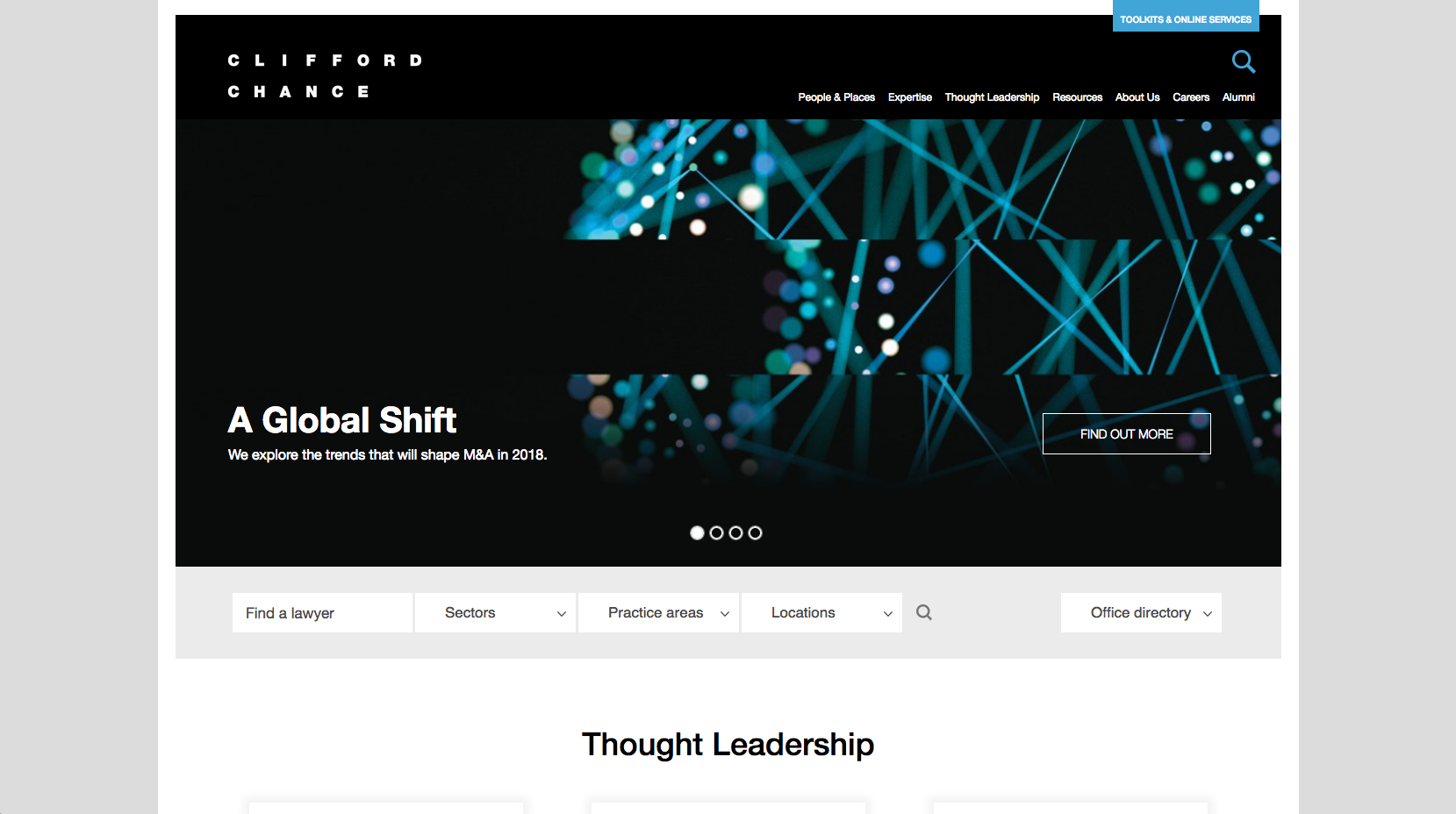
Clifford Chance have created a more minimalistic website design with a clear, image based focus. The scrolling banner image directs users to key areas of the website while also highlighting trends and the services they offer as a firm. Further navigation tools under the homepage banner push website visitors through to lawyers, sectors, practice areas and location content.
3. Allen & Overy

The Allen & Overy website features a rotating banner of images which highlight and link to important sector specific news. There is listed news ‘From across the network’ which is further highlighted along with a lead news panel showing ‘Brexit Law’. The website is not yet taking advantage of a mobile responsive design. There is a clear navigation and structure to the design, while also having the priority placement of ‘Find a Lawyer’ displayed in the bottom right corner. This feature is quite complex as it gives the options to filter by expertise, sub-expertise, regions, country and office, which allows very specific searches to be made. The map shows their international scope in order to help with their positioning as a global law firm.
4. Linklaters
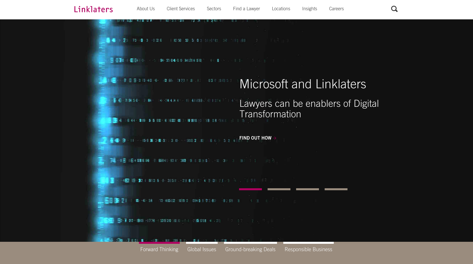
Linklater’s website home page has a strong focus on imagery, with the main banner taking up the majority of the screen. This scrolls to direct users to news content that differentiates Linklaters as a “forward thinking” firm. It also shows involvement with a charitable cause and knowledge-based content assets. The top navigation panel offers easy access to the key areas of the website that the majority of visitors will be looking for.
5. Hogan Lovells
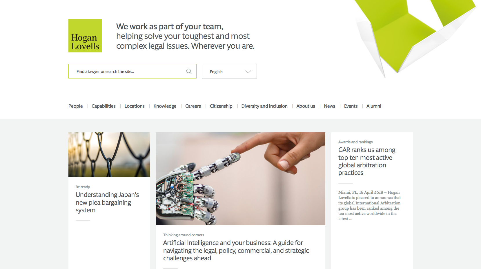
The brand led approach is striking with the use of an animated graphic to give the homepage a more visual, interactive feel. The navigation is stripped back with routes through to sector-based content highlighted prominently. The top-level navigation consists of a ‘burger-menu’ and a search facility which keeps the homepage easy to access. Large news panels use bold colours to draw attention to content. As the news panel expands, visitors are funnelled through to specific content. The page also contains a transparent positioning statement and links through to social channels.
6. Freshfields Bruckhaus Deringer
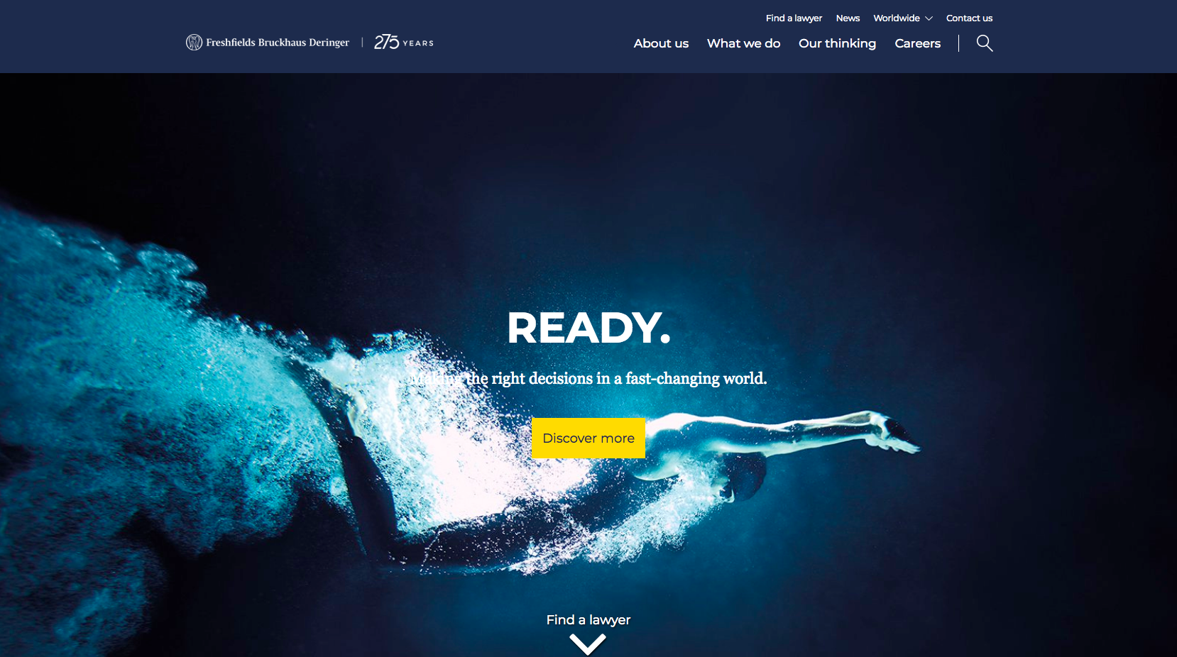
The Freshfields website clearly positions the organisation as a leading law firm. A large area of the homepage is dedicated to the rotating banner. Used alongside this, striking images and strong messaging are used to back-up the content displayed in the lead panel. This directs people through to the thought-based content and areas which aim to differentiate the firm from its competitions. Further down the page, there are panels to highlight news, recruitment opportunities and the size and global reach of the organisation which is highlighted in the form of a world map. The ‘Find a Lawyer’ search panel offers quick and easy access to profiles that can be filtered by multiple options.
7. Norton Rose Fulbright
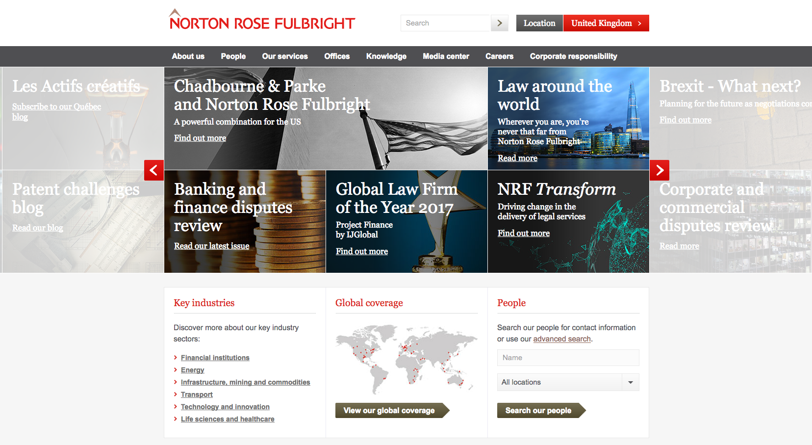
The Norton Rose Fulbright website prioritises news content through their main banner. They take a novel approach to the way the news content is displayed, using a geometric design on the rotating banner which allows panels of differing sizes to be populated with news. This allows the firm to draw more attention to lead articles. The images in the news area work well and the faded news to each side of the banner highlights to users that there is more content available to view. The page structure under the banner highlights key industries and a quick search (with a link to an advanced search) for lawyers profiles. There is also a map that displays their international coverage and reinforces the message that Norton Rose Fulbright are a global firm. The website has not yet implemented a mobile responsive design.
8. Herbert Smith Freehills
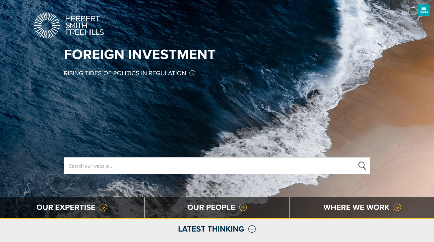
The Herbert Smith Freehills website displays striking imagery which draws attention to the banner. It uses a modern, clutter-free design that helps enhance the user’s journey through the website. With obvious calls to action located at the bottom of the page, it has taken into account how audiences will want to navigate through the website. The prominent search facility directs visitors to a filtered search facility which allows results to be more accurately refined. Expertise, People and Locations are each highlighted above the news areas with one leading article and three smaller articles following. The website also displays a ‘sticky burger menu’, which follows the user’s journey down the page. The main navigation appears from the right-hand side after the navigation menu is clicked on.
9. CMS

The CMS website displays a large panel on the homepage to highlight their news content. The news feed displays a mixture of bold block colours and images, each of which can be adjusted in size to give prominence to the different areas of news based content. The uncluttered layout gives it a fresh feel that is easy to navigate.
CMS take a conversion focused approach to the homepage which contains CTA’s (Calls To Action) such as a “How can we help you?”, allowing visitors to submit a quick two field form to the firm in order to instigate communication. A key contact is also displayed on the homepage along with the nearest office location, and the latest tweet and upcoming event information.
10. Ashurst

Ashurst have taken a simplistic approach to their website home page with an eye catching, image focused sliding banner. The banner uses subtle movement to increase the focus on the content it contains. A news panel displays one block that highlights the latest awards the firm has won, while another block displays the latest deal. The navigation bar is concise, with only five links, giving it a clutter-free look.
An obvious positioning statement has been placed above the four panels further down the page, directing users to information about the firm, expertise, location and careers. Quotes have been taken from ‘Chambers Global’ while a map of the world displays figures about the number of awards the firm has won, the number of partners, the number of offices and the year the firm was founded (1822). Each of these help position Ashurst as a large, global law firm with a wide variety of credible experience.
11. Clyde & Co
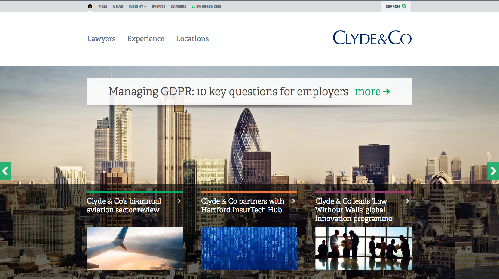
Clyde & Co use high quality, vivid, eye-catching imagery on their website home page. Each scrolling banner provides new links to information. The top-level navigation panel has three options focused on Lawyers, Expertise and Locations. A large banner area which scrolls (upon click) uses positive messages about awards and business areas to help build confidence. Three small panels run across the page to highlight news panels, while the remainder of the page contains links to other parts of the website including careers pages, a longer list of latest news articles and closest locations. The layout is minimalist and easy to navigate, while still showing all of the links to information that may be needed.
12. Slaughter and May
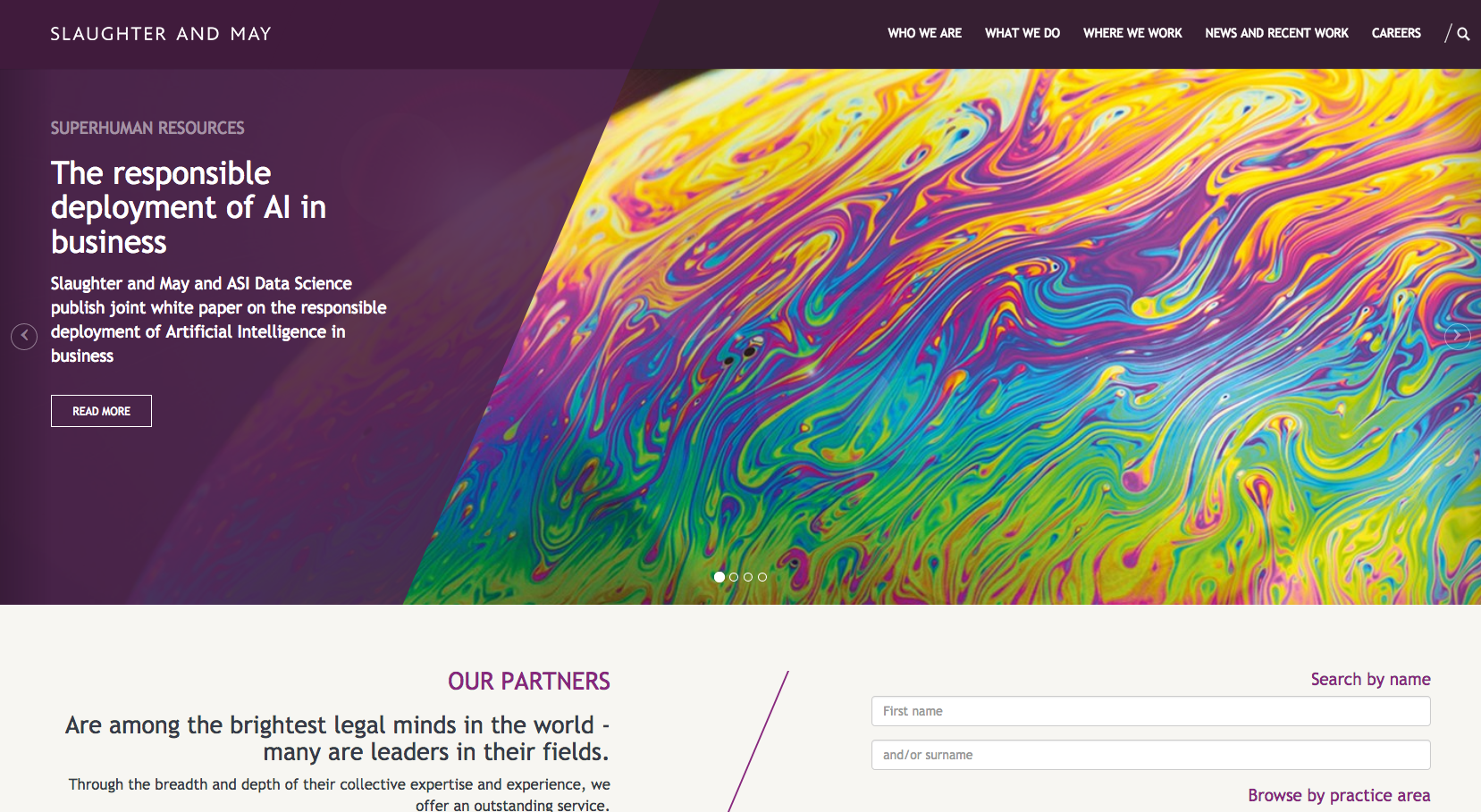
The Slaughter & May website displays clear positioning in the form of bold statements on the home page sliding banner. The dedicated panel promotes case studies, microsites and recruitment. Below the panel sits a search facility that allows users to browse lawyers by first name, last name or by practice area, offering the chance to access key content quickly. Listed news and deals are positioned above a panel dedicated to trainee solicitors. Visitors are then offered a chance to browse a legal service or view publication based content in two further panels. The bottom of the page contains an enquiry CTA that asks the question “if you would like to find out more about our Legal Services, Careers or Press and Media Contacts, please get in touch”.
13. Eversheds

Eversheds have taken a minimalist approach to their website design. They position their locations in the form of a list and also a clickable map on the global home page, after which visitors are directed through to a regional landing page. A rotating banner highlights confidence building case studies which outline large deals, reports and awards.
14. Pinsent Masons
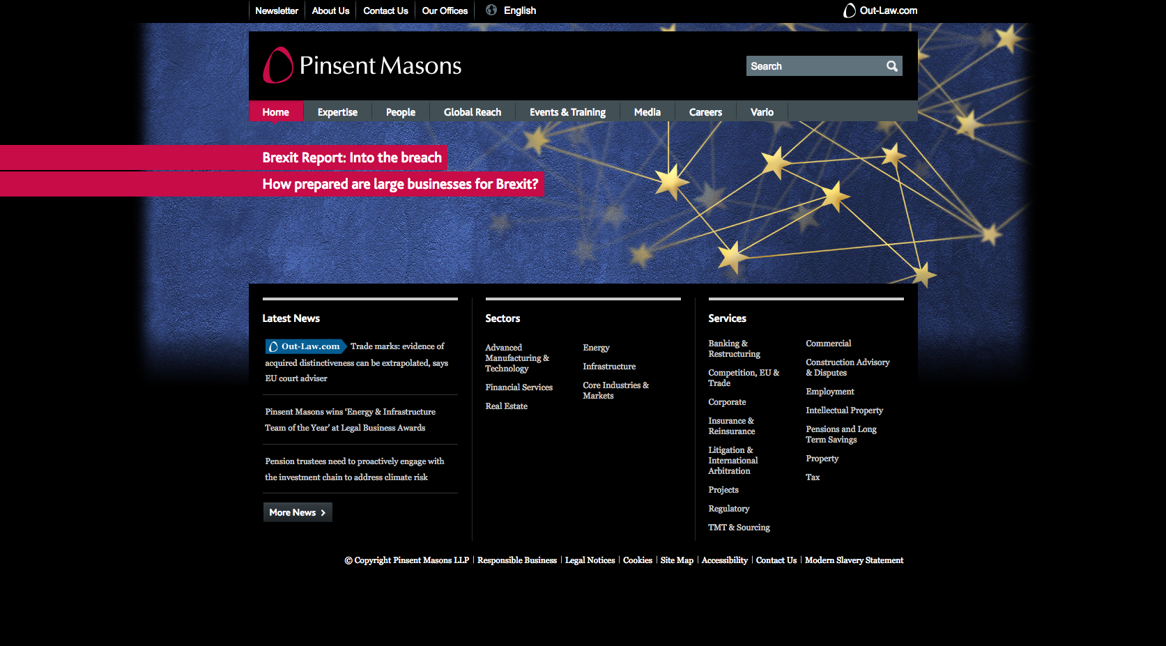
Pinsent Masons have taken a slightly different approach with a black background and the visible use of their branding colours included in the design. The top section of the homepage is dedicated to the navigation (including prominent links through to sub-brands) and a banner displaying a lead news item. There is obvious prioritisation of their sectors and business areas located at the bottom of the page.
15. Gowling WLG
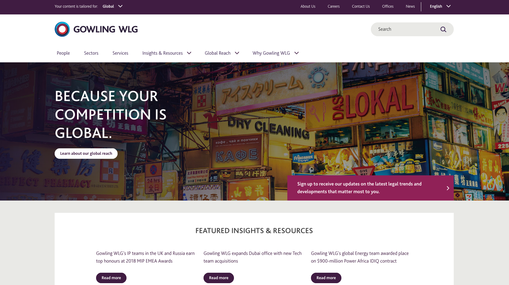
The Gowling WLG website promotes a global image. The main banner image displays the positioning statement of the firm which adds to the simple layout. Scrolling down the page, the global reach of the firm is again highlighted above panels containing Sectors and Services push points.
16. Simmons & Simmons

The homepage for Simmons & Simmons demonstrates good positioning with their branding statement. The layout is easy to navigate, while still displaying quite a lot of information. They use a different style of rotating banner which transitions in order to draw the eye towards a headline and lead-in text, before allowing a visitor to click through to view the full article. The background image is subtle and atmospheric. The size and scope of the firm is highlighted in an evident positioning statement which sits alongside a large People Search box which allows visitors to find a lawyer by searching by name, service, sector, region or office. On the bottom half of the page, Sectors and Markets is highlighted with two other panels linking to microsite content, quick links and news articles. The site it not yet benefiting from a mobile responsive design.
17. Bird & Bird
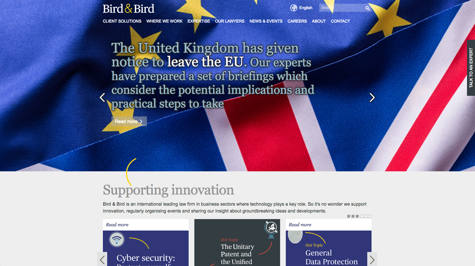
Bird & Bird have a very crisp website design, with the main focus being the sliding banner, used without images. The large banner panel rotates through striking images and messaging that highlights a mixture of thought-led articles and content that covers both European and global stories. These help demonstrate the firm’s size and scope. Their positioning statements are clearly displayed on the website to help build trust. The rest of the content is situated below the line but still uses a very engaging and interesting layout. Further down the page is a Hot Topics panel entitled ‘Supporting innovation’. This is dedicated to sector focused content where technology is prominently featured, focusing on Energy, 3D Printing and Data Protection.
A ‘Talk to an Expert’ tab on the right side of the homepage stays in a static position as the page scrolls. When clicked on, users can search for an individual, sector, practice area or location.
18. Berwin Leighton Paisner
Berwin Leighton Paisner has now merged with Bryan Cave.
19. Taylor Wessing
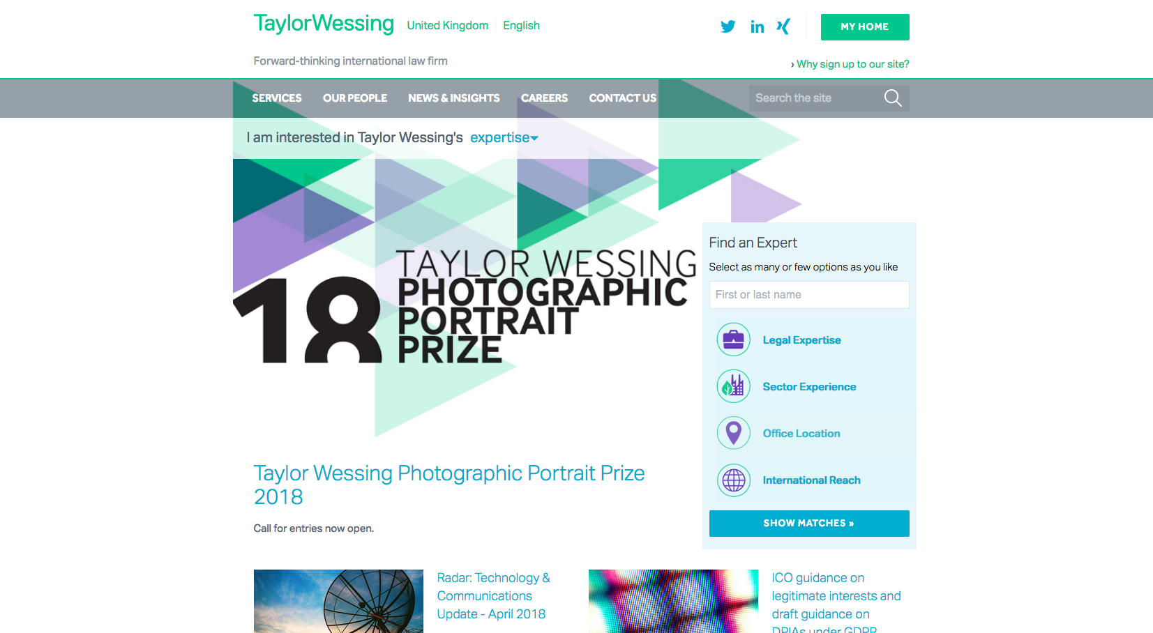
The Taylor Wessing website offers a good structure for their users to be directed through to relevant content easily. The use of geometric shapes and imagery make it quite eye-catching. The prioritised content surrounding ‘Find an Expert’ is clearly placed as one of the main CTA’s. This allows visitors the option to narrow their search results by Expertise, Sector, Location and International Groups.
The lead news panel’s featured image takes up a large portion of the screen and draws attention to specific, focused content. Moving down the home page, further news and events are displayed alongside an ‘About Taylor Wessing’ panel which pushes traffic through to an infographic demonstrating the size of the firm, its global coverage, recent stories in the form of directory quotes and recent awards.
Towards the footer at the bottom of the homepage, Taylor Wessing displays an ‘Expert Insight’ paragraph which contains a short quote from a lawyer which offers an insight into a hot topic. Finally, a Twitter feed is displayed alongside popular tags which direct traffic through to popular pages on the website.
20. Irwin Mitchell

The straightforward design and layout which has been implement on the Irwin Mitchell website makes it very easy to navigate. Push points under the top level navigation highlight the most valuable content including reports, video and educational content. The call to action is located in the centre of the page as a search bar for the whole website, rather than just being used to find a lawyer like many other law firm websites. Three panels display ‘Most visited in Personal Legal Services’, ‘Most visited in Private Wealth Services’ and ‘Most visited in Business Legal Services’ with an option to ‘View all’ which takes visitors to a full list of services aimed at either Business or Personal clients.
Scrolling down the page, there is a clear call to action panel that encourages people to communicate with the firm by either calling a free phone number, emailing or connecting with Irwin Mitchell on their social media platforms.
A panel containing a map of the UK and office locations pushes traffic through to regional contact pages and the area also contains a postcode search to allow visitors to find their nearest office.
A search panel directs people through to lawyer profiles and is displayed alongside a twitter feed and a row of lawyer profile photos to help give the page a more approachable feel. A large panel is then dedicated to review and feedback content from clients in the form of Trustpilot reviews. This type of content builds confidence and appeals to public clients who will be viewing the website before making a decision to get in touch.
21. Osborne Clarke
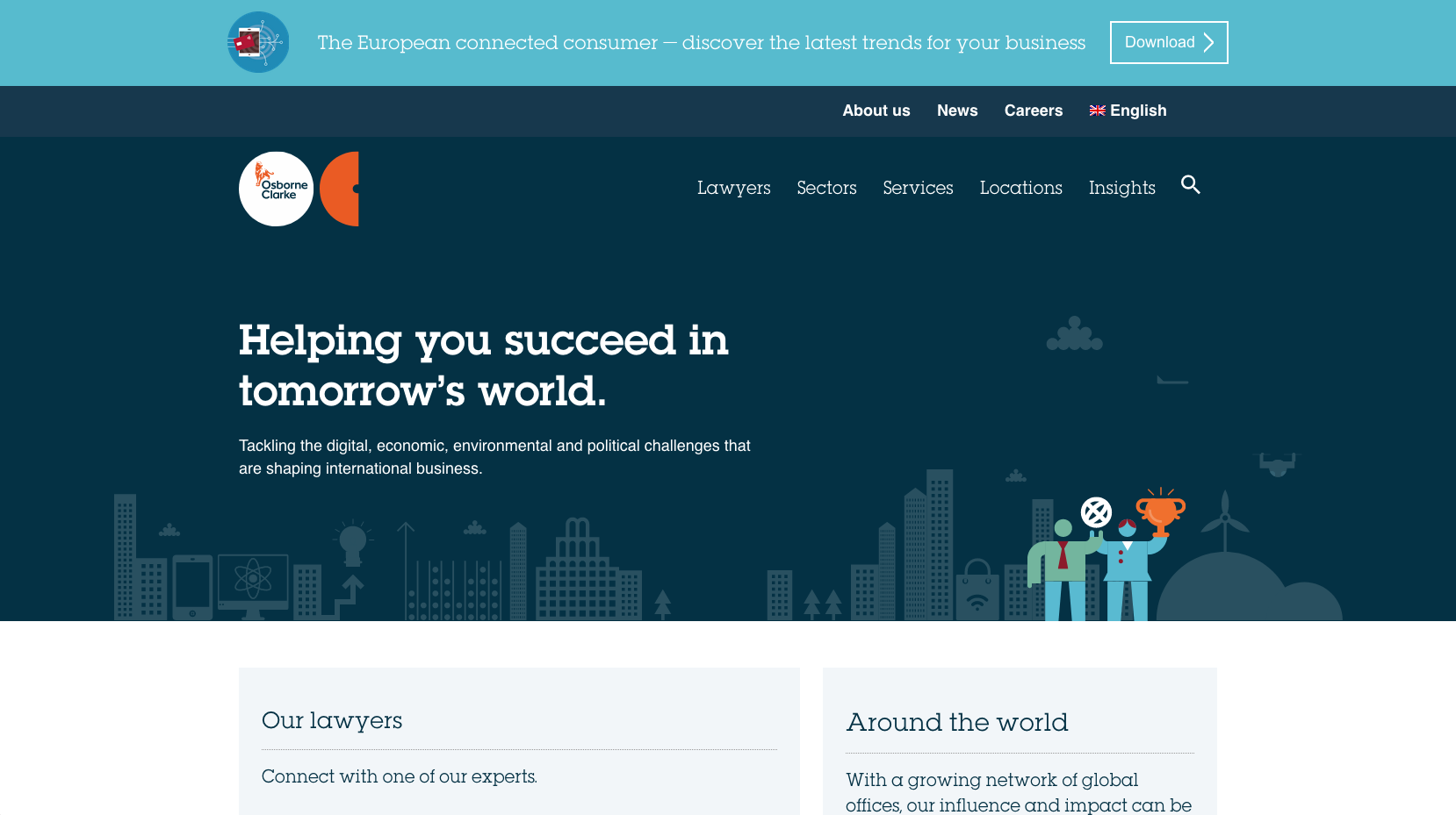
The Osborne Clarke website has gone down a more graphic route with their website brand style. The home page banner area is dedicated to displaying their strapline. Underneath the banner, visitors are asked to search for lawyers by Name, Location, Sector and/or Services, while the second panel pushes traffic through to regional then to location specific content. Push points directing people through to Sectors and Services landing pages contain transparent messaging and the brand graphics which are also displayed alongside further content on the page including ‘Insights’, ‘Careers’, and ‘About us’ information. The navigation bar at the top of the page features the main categories without making the page look cluttered.
Osborne Clarke have designed the panels on the homepage to work as push points, displaying an overview of the content and the brand graphics which take visitors to landing pages rather than displaying lots of links through to more specific content.
22. DAC Beachcroft

DAC Beachcroft use a subtle video on the website home page which sits behind a site search panel and positioning statement ‘A leading international law business’. The video on the top of the homepage offers a little more depth, while the sliding banner underneath highlights various lawyers profiles and news content. Scrolling down the page takes you to a panel with push points directing users to lawyers, office and expertise information, with access to further news content and events underneath.
23. DWF
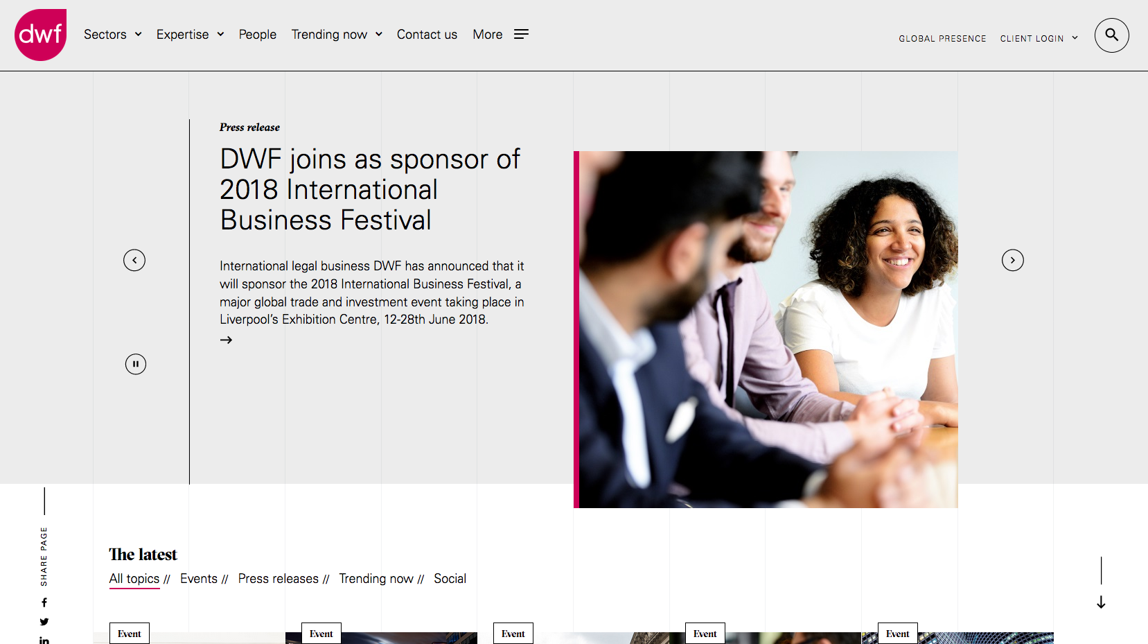
DWF have a very user-friendly layout with a bright colour scheme to match the branding. The top level of navigation is easy to access and provides distinct links through to the important pages, as well as having the sticky banner to find a lawyer. DWF build confidence as visitors navigate further down the homepage by offering news, insights and knowledge-based content.
24. Addleshaw Goddard

Addleshaw Goddard use a thin strip at the top of the home page that when clicked on, pulls down a map of the world split into regions. Visitors can then navigate through to dedicated landing pages for each region.
A striking image sits behind a transparent positioning statement and strapline. While underneath is a ‘Find a person’ search panel offering access to lawyers profiles. Expertise are listed underneath in the form of links through to Sectors and Specialisms.
A large ‘Latest updates’ area at the bottom of the home page displays featured events, insights, news and a twitter feed. The panel makes good use of imagery, titles and lead-in text to push traffic through to the article based content.
25. Stephenson Harwood
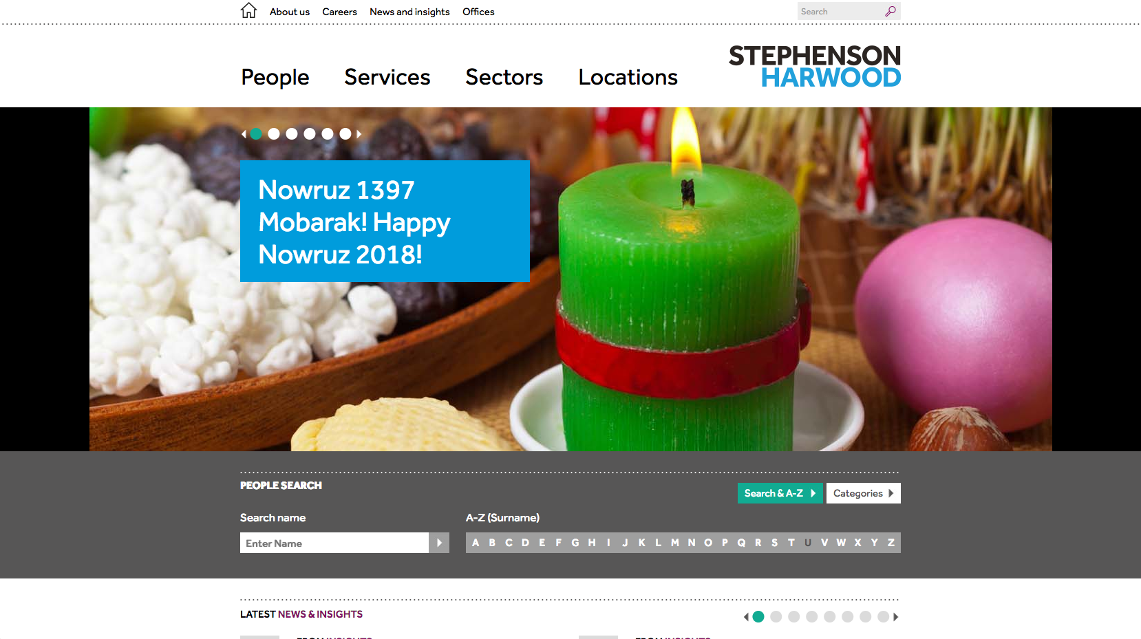
Stephenson Harwood’s homepage banner uses striking imagery alongside content displayed in panels which highlights the latest news. Moving further down the page, a People Search panel allows visitors to search for a lawyer by name or by using an A-Z. A panel of scrolling content highlights latest news and insights while at the bottom of the page, panels containing the brand imagery push traffic through to Sector and Services focused content.
26. Withers
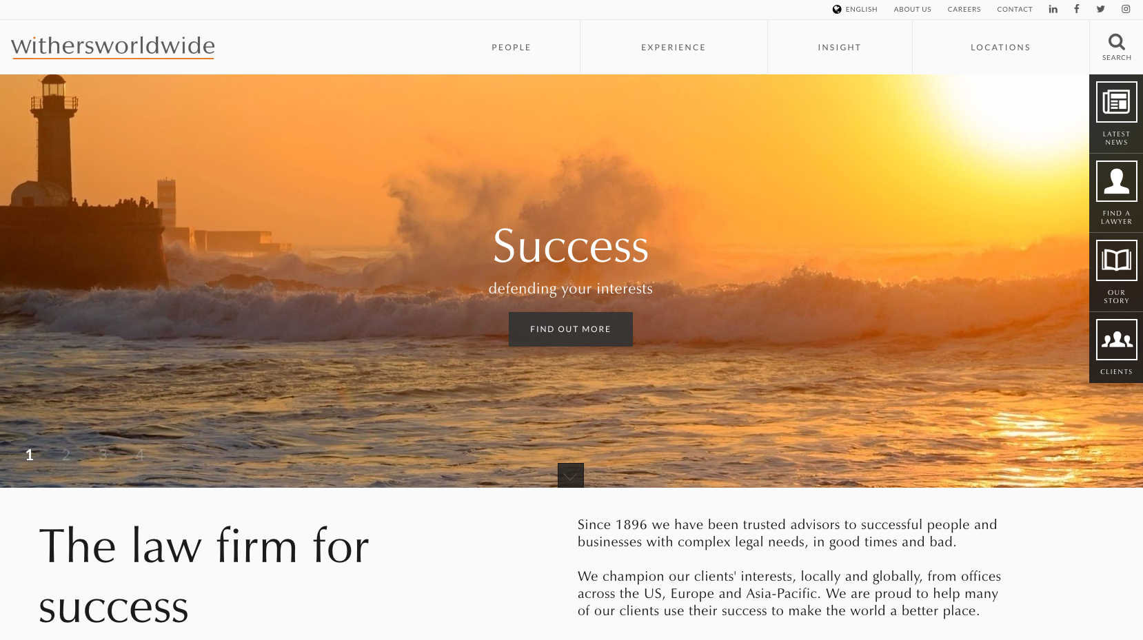
Withers have a strong focus on striking imagery which has been used in the scrolling banner on the homepage. Each of the slides directs users through to the private client and business focused-pages. There are navigation panels both on the top and right-hand side of the homepage, both of which are sticky, meaning that people always have quick access to the news and lawyers.
Further down the homepage, users have the option to filter through to specific content suited to their needs. With a heading of “How Can We Help?”, the Withers website has a number of boxes containing scenarios user’s might be experiencing such as “I want to invest overseas”, and “I need help with my divorce”. These options help separate users into business and personal services, in a user friendly manner that allows content to be accessed easily. However, as this content is pushed quite far down the homepage, it is likely that it may not be as visible to those landing on this page.
27. Macfarlanes

The Macfarlanes website uses striking imagery that fills the whole homepage screen.
They also take a different approach to directing website visitors to the correct content by asking people to navigate using “I’m looking for a service or person”. This allows visitors to click through to the different services or browse lawyers specialising in a certain areas of law.
28. Holman Fenwick Willian
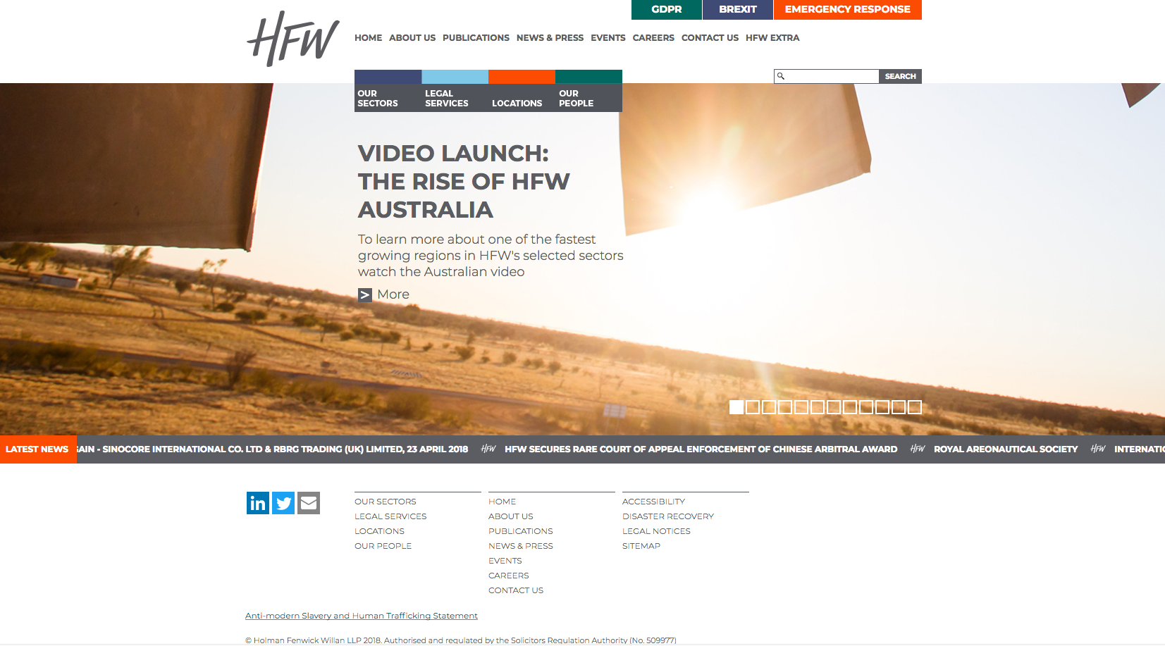
Holman Fenwick Willian has very bold imagery used continuously in their scrolling banner. The overall design is very simple but used well to highlight key areas. The page uses a scrolling banner to emphasise the key areas of business, news content and success stories in the form of awards. The navigation helps within the banner area directs visitors through to Sectors, Legal Services, Locations and Our People. A continual scrolling area is displayed underneath to show the latest news.
29. Fieldfisher
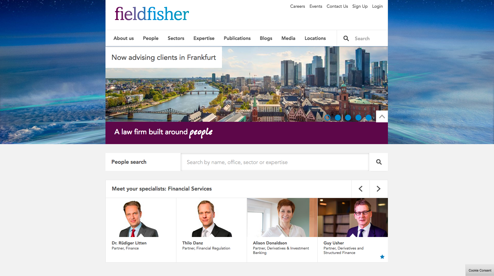
An uncomplicated website layout with easy to access functionality. The imagery is contrasting in the way it is layered and the site shows an obvious positioning statement underneath the sliding banner. The prioritised people search sits under this panel, displaying the faces of some of the lawyers. This gives the website a friendly and approachable feel.
30. Watson Farley & Williams
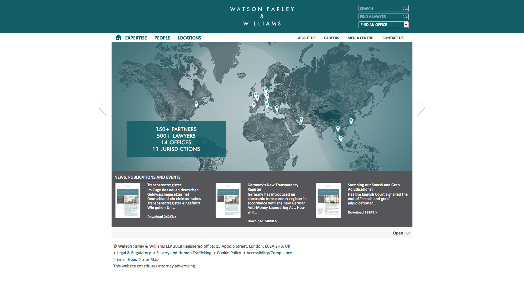
A very professional looking website with positioning statements presented in bullet points on the large map, showing their global scale. This tool is interactive making the whole website much more engaging. Expertise, People and Location are all tabs on the top banner giving the user ease of access.
31. Mishcon de Reya
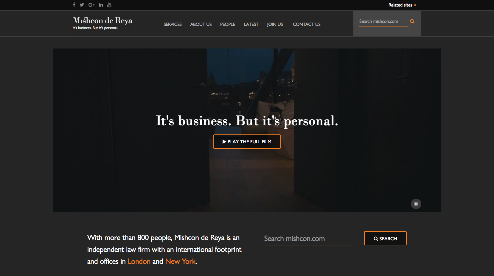
Mischon are another law firm with a dark colour scheme website. Their main banner is in the form of a video, which is an engaging way to keep the user on the page to increase brand awareness and retention. They also display their recognisable strapline over the video, with the visible tabs on the top banner offering access to the key areas of content including services and lawyers.
32. Kennedys

Another dark website, Kennedys use a basic layout to provide users with the ability to navigate through the website easily. There is a clear positioning statement placed above links to the areas of the world they are present in. The content below this panel offers access to deeper areas of information, such as latest news and career opportunities.
33. Charles Russell Speechlys

Charles Russell Speechly demonstrate a concise, professional looking website through their layout and strapline which is positioned prominently in the first scrolling banner image. The imagery used is striking and catches the user’s eye as it rotates through various news articles. Another feature of the website is the People Search which allows visitors to search by keyword or name and service area, while visitors can also scroll through featured Partners, sitting to the right of the Search People panel. Further content displayed lower down the page directs users to the correct content, with a specific panel dedicated to filtering business and personal clients. Underneath is more sector focused content following on with News & Insights.
34. Nabarro
Nabarro has now merged with CMS.
35. Travers Smith

Travers Smith have a distinguishable banner at the top of their home page displaying information about the sectors, practice areas and people. Their slider banner presents images related to the different areas of the firm, rather than displaying news (current affairs), which is displayed in smaller boxes beneath.
36. Shoosmiths

Following the brand colours of Shoosmiths, the bright green areas of the design add a pop of colour to the dark background. Their ‘Can We Help?’ section is the main call to action on the homepage, with the drop-down menu allowing users to enter their requirement. The website has a modern feel to it, with all the information being presented in an easy and navigable way, however, it is not yet mobile responsive.
37. BLM
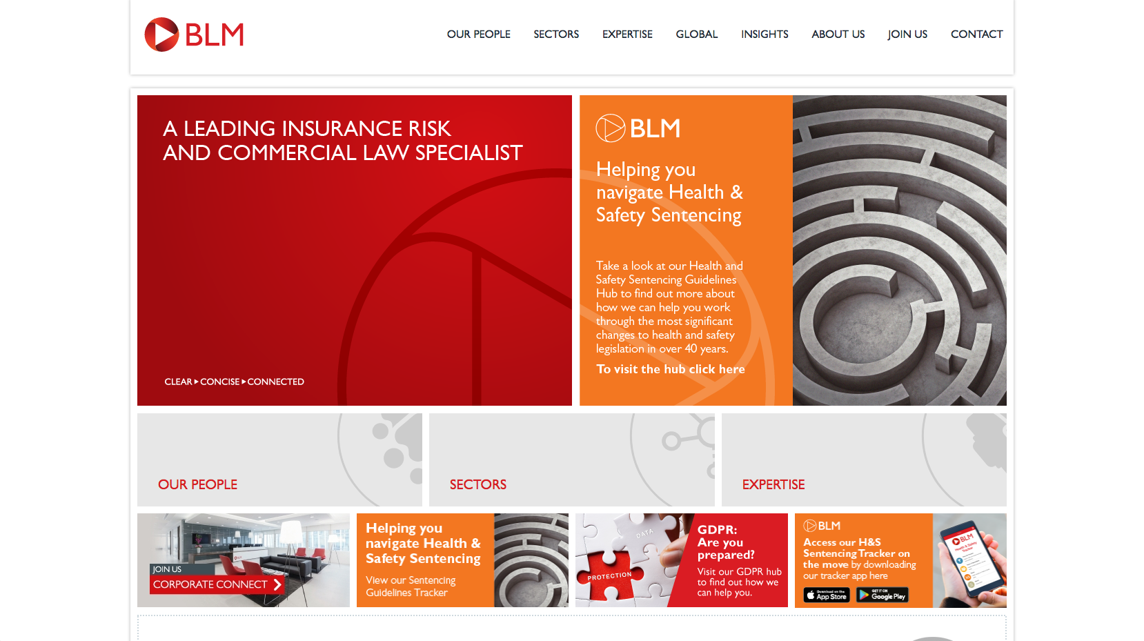
The BLM website has been designed to clearly highlight the key business areas the firm practices in. The User Interface offers clear calls to action which help optimise user journeys and funnel more traffic through to conversion focused areas of the website.
38. Bond Dickinson
Bond Dickinson has now merged with Womble Carlyle Sandridge & Rice
39. RPC

RPC have used a background video of London to effectively engage their website visitors. The video displays their strapline “We see things differently”, next to a call to action which encourages visitors to get in touch. The top navigation panel allows, users to access the services, expertise and people, along with the other main areas of the website.
40. Hill Dickinson
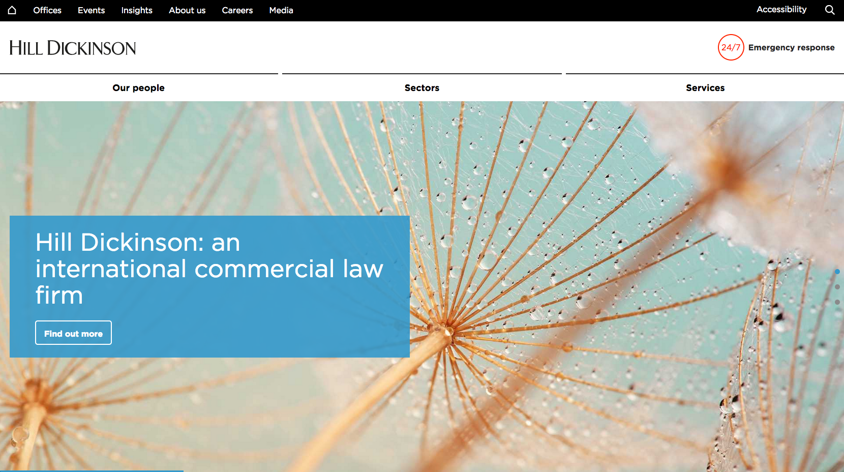
The sliding banner on the Hill Dickinson website displays images relevant to the sectors they have expertise in. Underneath this is a short positioning statement, followed by news and insight content.
41. Olswang
Olswang has now merged with CMS.
42. Trowers & Hamlins
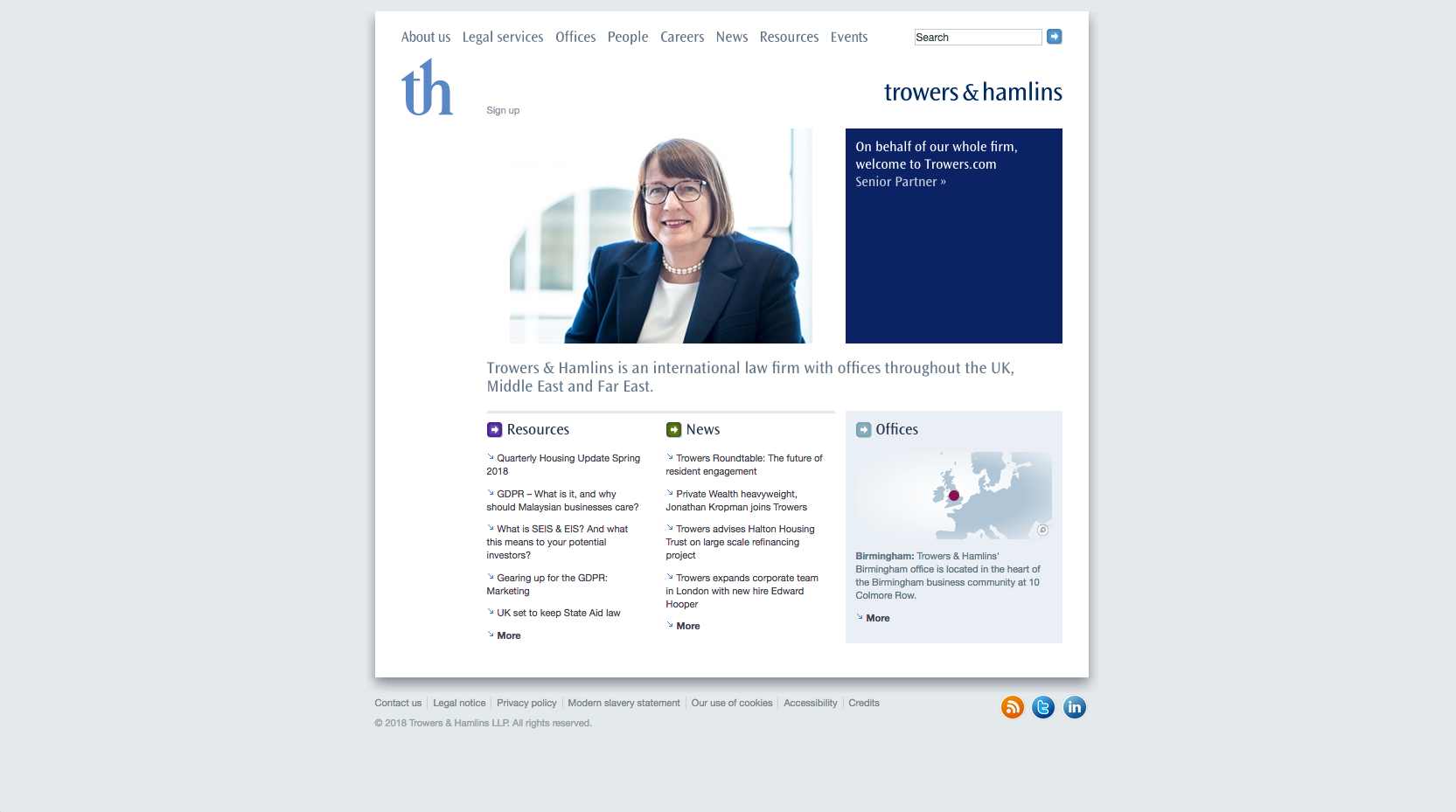
The Trowers & Hamlins website has a simple, non-mobile responsive design. The purple box against the light design is something you are instantly drawn to, directing users to the careers section of the website. Below this, users are able to view news content and office locations. The home page imagery displays casual photos of lawyers which gives the firm an approachable feel.
43. Weightmans
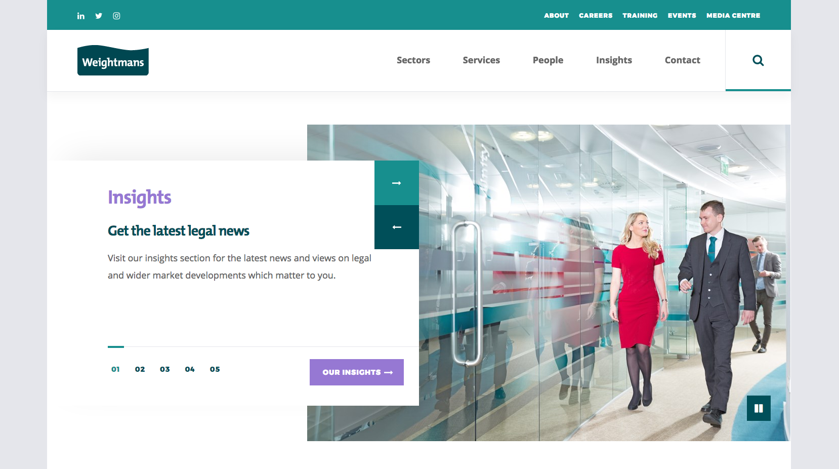
Weightmans use a minimalist style design and layout on their website. Their positioning statement is clearly positioned below the homepage banner, while also offering straight-forward calls to action for users to follow the firm. Trending topics are also displayed under the home page banner to further highlight popular content.
44. Mills & Reeve
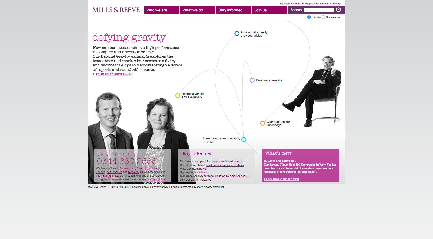
Mills & Reeve use an interactive design which uses graphics alongside photos of lawyers. Their prioritised content consists of their contact details and a small section on latest news. The website could take advantage of a mobile responsive design but overall, has a professional feel to it.
45. Ince & Co
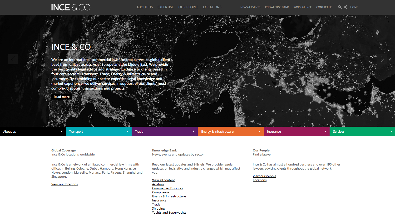
An easy website to navigate with obvious sections highlight for their sector areas which are displayed in vivid colours. The rest of the content is displayed in a subtle header navigation bar. The website has a slick structure displaying interesting and current themes that represent a professional and well-maintained design.
46. Burges Salmon

Legal updates and news content have been prioritised on the Burges Salmon website, while the rest of the content is easy to navigate from the top level navigation. Their colour scheme is bold, showing a gradient of different colours featured in each block.
47. Stewarts Law

The Stewarts Law homepage focuses on using imagery to fill the screen. Overlayed on the image is the law firms strapline which works to to position them against their competitors. Below this, the strapline flows into the positioning statement and then directs users through to the expertise and people pages.
48. Gateley
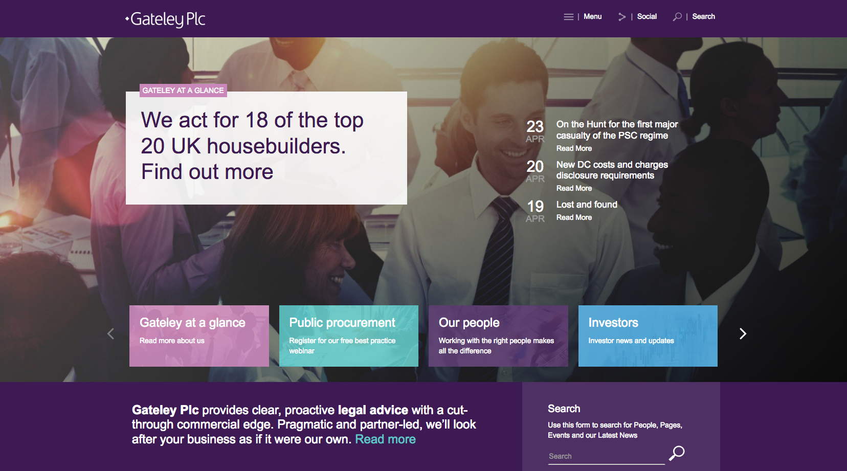
A clear and concise website design with an informative sliding banner. Their prioritised content is displayed in eye-catching boxes towards the bottom of the page, while the rest of the content is hidden in a drop-down burger menu. A navigable and professional looking website which maintains a good colour scheme throughout.
49. TLT

TLT use their homepage banner to direct users through to news items and resources. Below this is the strapline and access to sectors, services, locations and people pages. There is also a quote from one of the partners which helps to build confidence and position the firm as a knowledge leader.
50. Blake Morgan

The imagery used on the website positions Blake Morgan as a traditional city firm. Their main sections on Who we help, What we do and Our people are clearly prioritised so as to be the main content on the homepage. The layout and design of the website is very easy to navigate.
51. Freeths
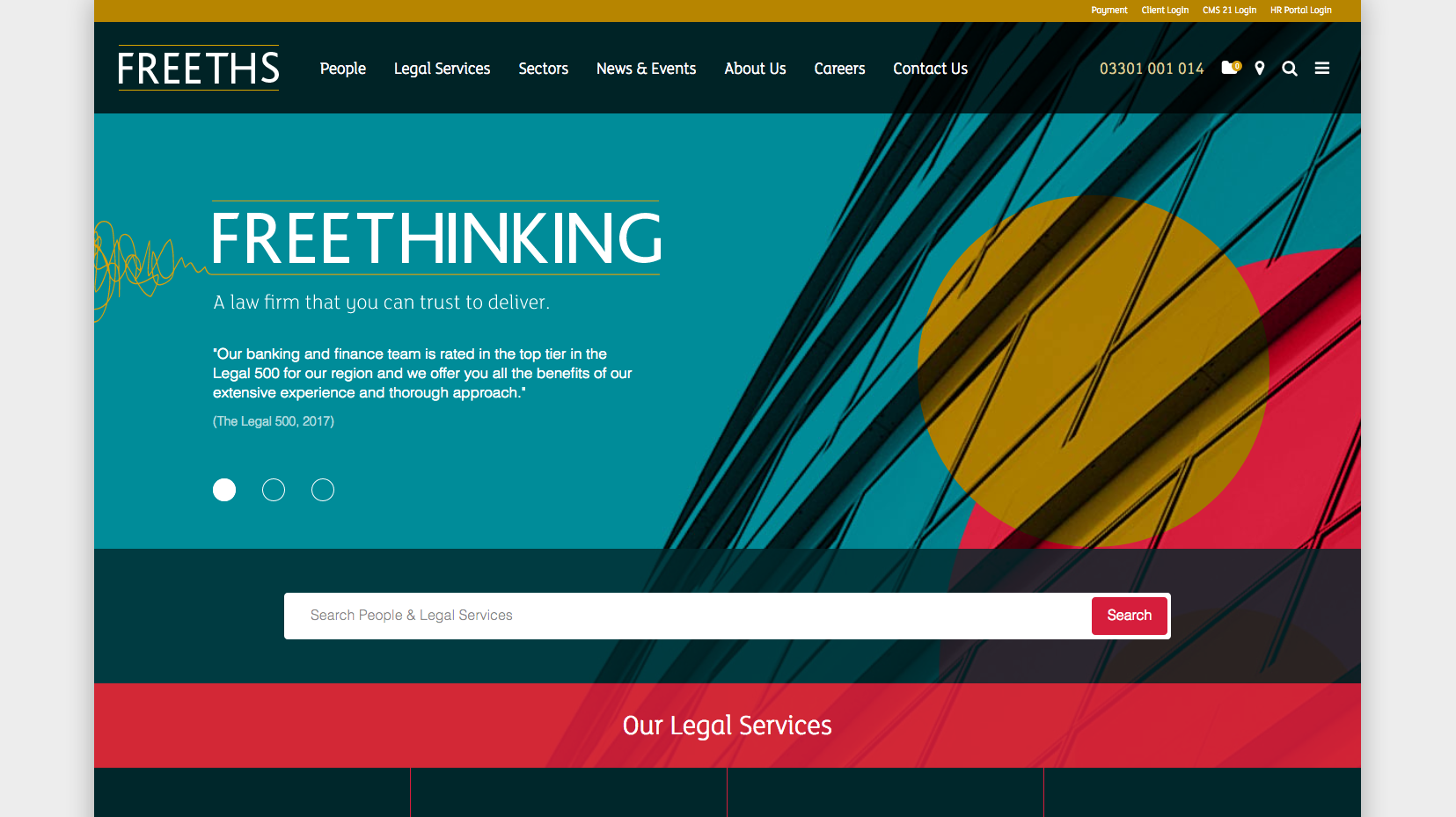
With a striking design, the new Freeths website offers clear calls to action and directs users through to relevant content. The bold graphic imagery in the banner area helps to highlight the strapline and builds confidence with various quotes. Below this is a large search bar that allows users to search for people and legal services. Further down the page is more confidence building content, as well as featured news content.
52. Shakespeare Martineau
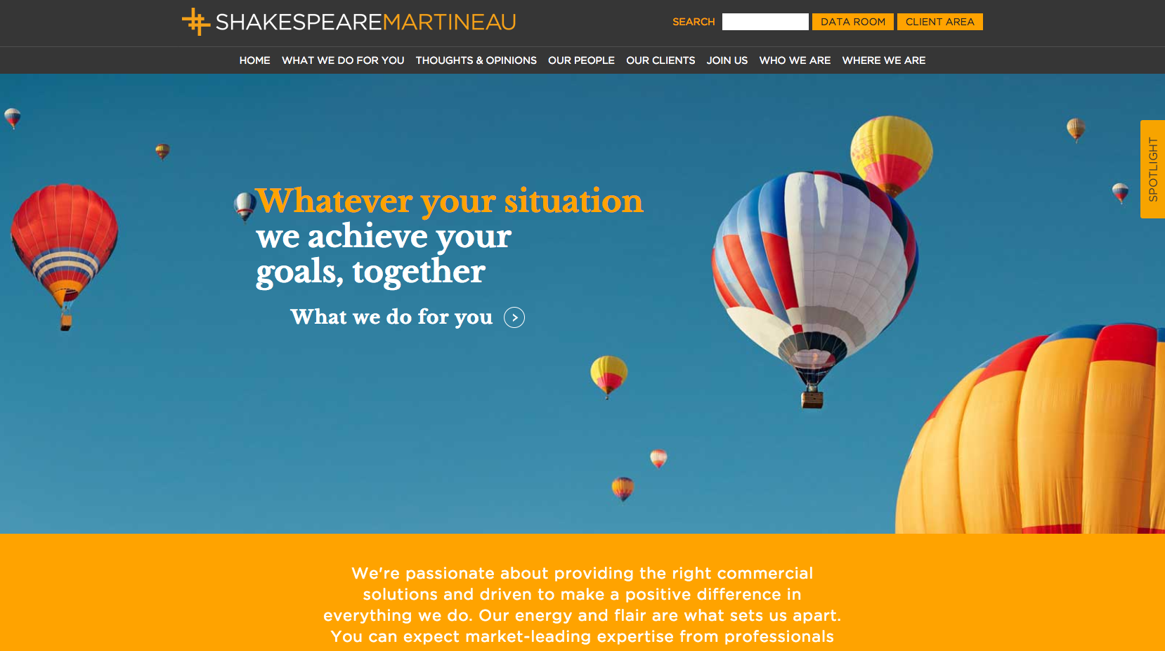
The Shakespeare Martineau website has a strong focus on imagery. They feature a short positioning statement on top of their main image which will help build trust with potential clients.
53. Penningtons Manches

Penningtons Manches have a distinct website design, reflecting the firms modern brand logo. The layout is easy to navigate with a strong focus on directing users through to news and event content.
54. Browne Jacobson

A straightforward homepage design with a sliding banner and positioning statement underneath. The Browne Jacobson website strikes a good balance between imagery and content.
55. Brodies
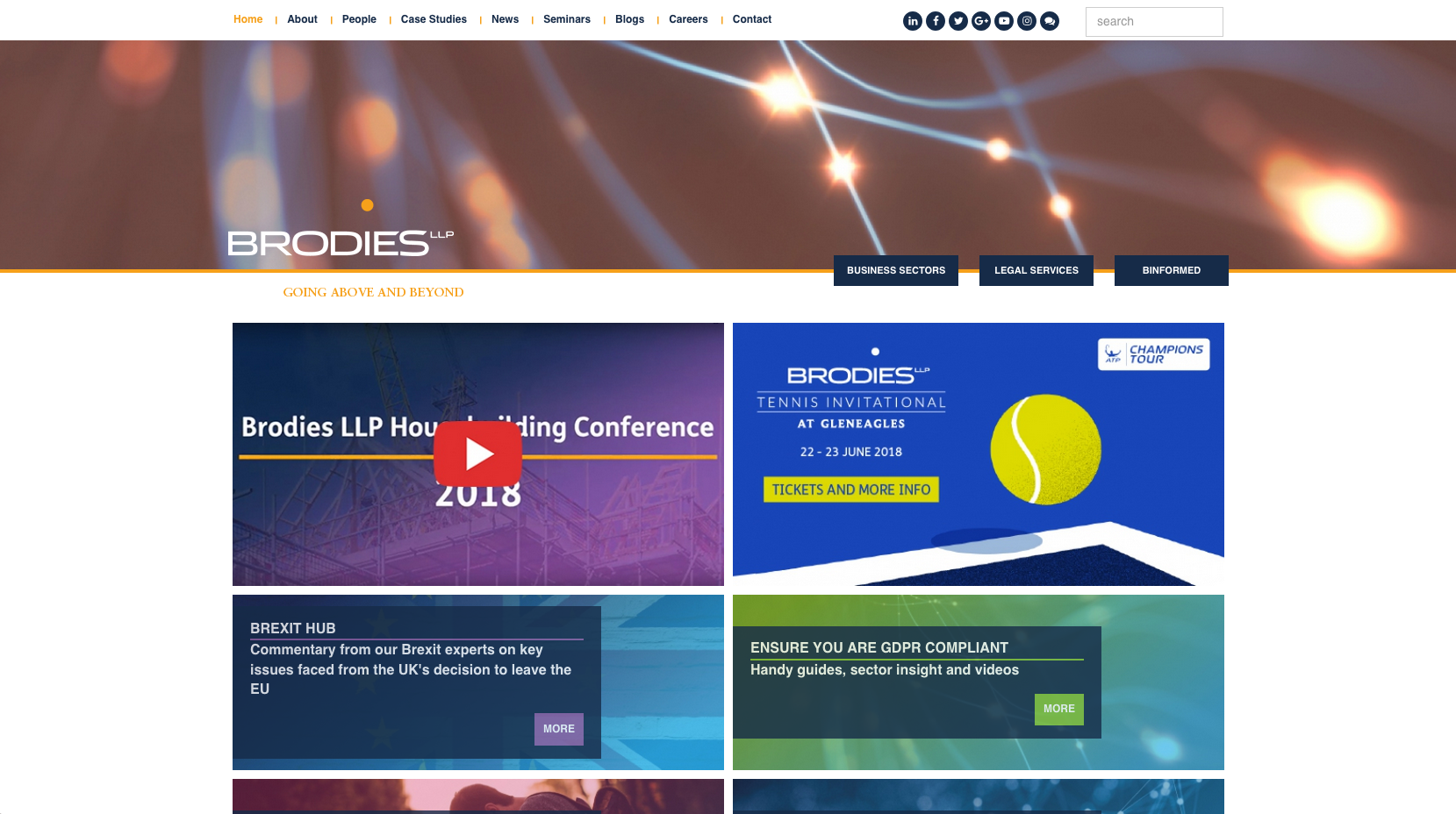
The Brodies website has a very different look and feel to other law firm websites featured in the top 100. The main focus is on the imagery displayed in the sliding banner across the width of the website. Their prioritised content is mainly focused on current news topics which would benefit from a mobile responsive design.
56. Keoghs
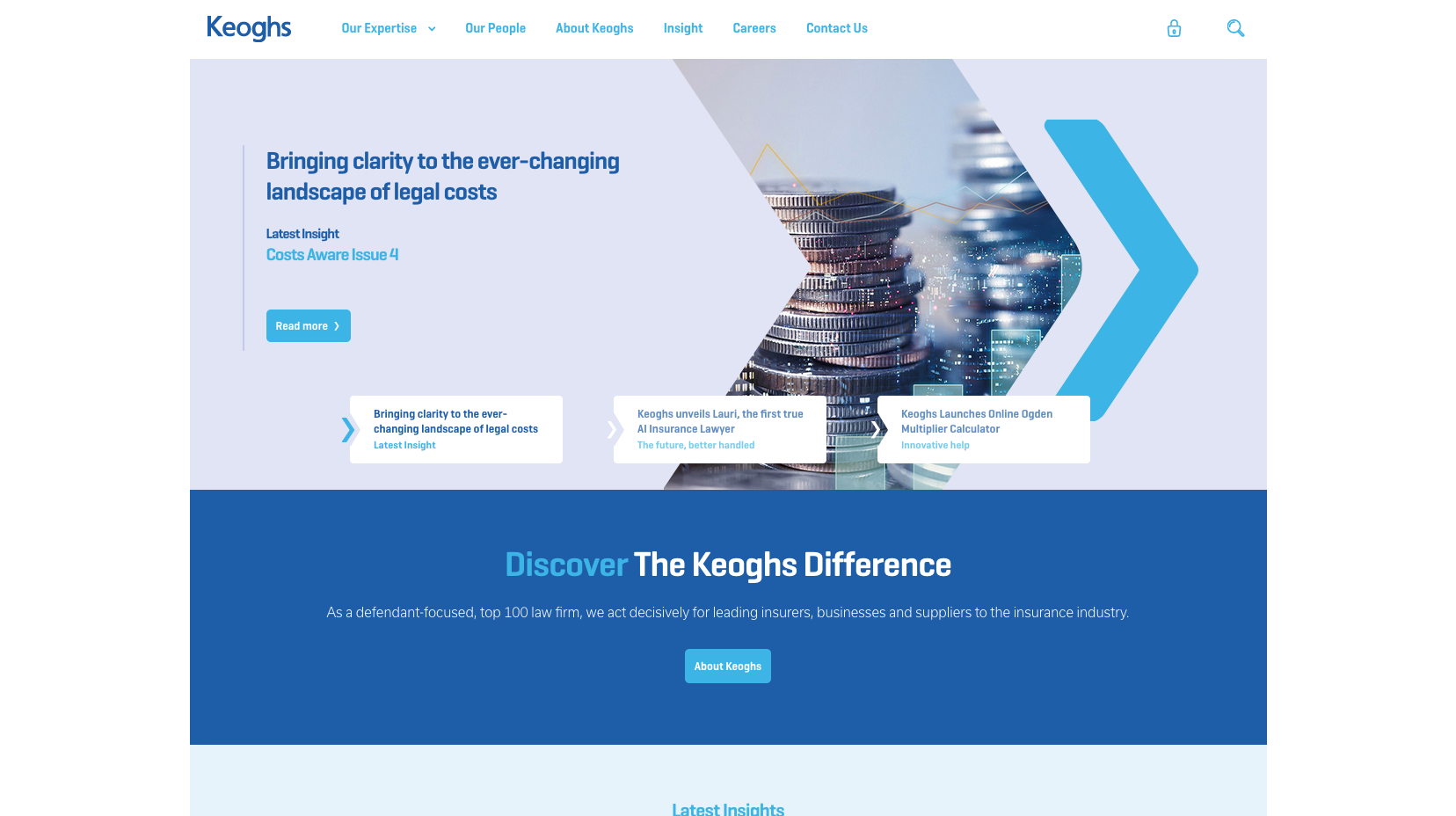
Another clean website design, that focuses on imagery rather than text. The sliding banner image features short, snappy eye-catching copy which will increase exposure to key messaging. It also features a short but transparent positioning statement, which directs users to learn more about the firm.
57. Farrer & Co

There is a straightforward positioning statement next to the latest news content. The rest of the information is clearly presented in the coloured banner heading at the top of the page allowing users to navigate through to the people and practice area pages.
58. Burness Paull
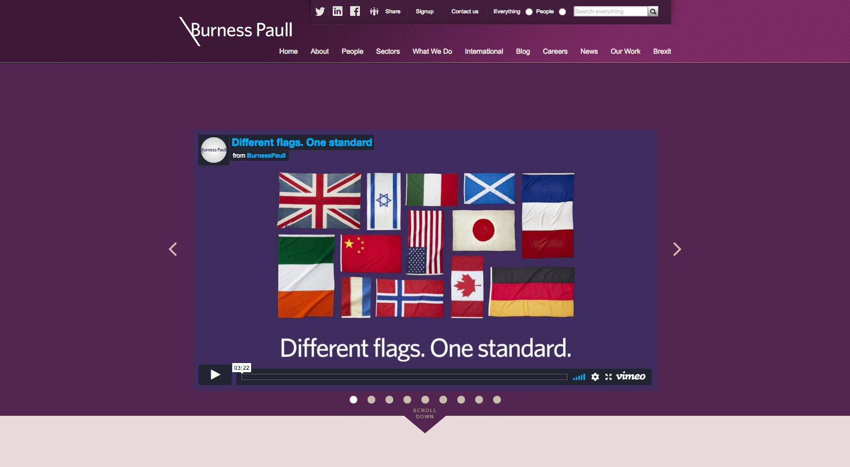
The Burness Paull website features a sliding banner as the home page focal point. Their top level navigation makes the website easy to navigate, while the content below focuses more on the details about the firm which are reinforced using positioning statements.
59. Howard Kennedy

The website has a simple look to it, with a tidy layout and easy to navigate pages. The imagery used in the sliding leads into a transparent positioning statement which sits above a search panel that allows people to refine a list of the firms lawyers.
60. Shepherd & Wedderburn
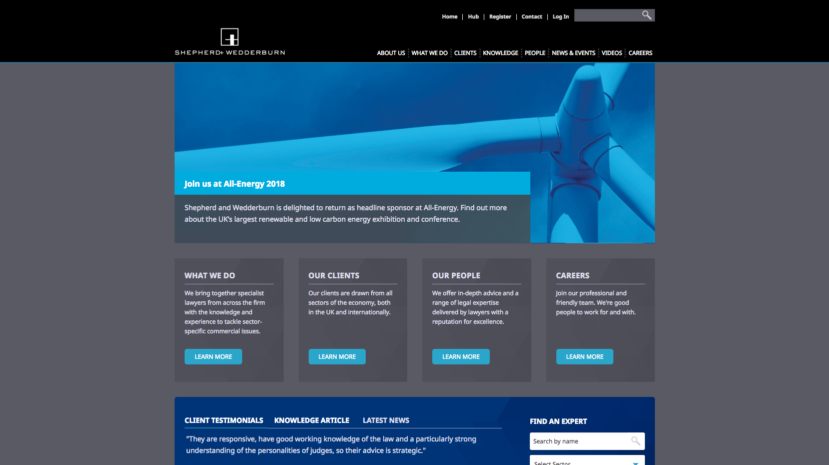
The Shepherd and Wedderburn website has clear calls to action directing users through to practice area, people and careers pages. They also offer a ‘Find an expert’ section, making the website slightly easier to navigate. The home page also contains client testimonials which will act to build confidence.
61. Fladgate
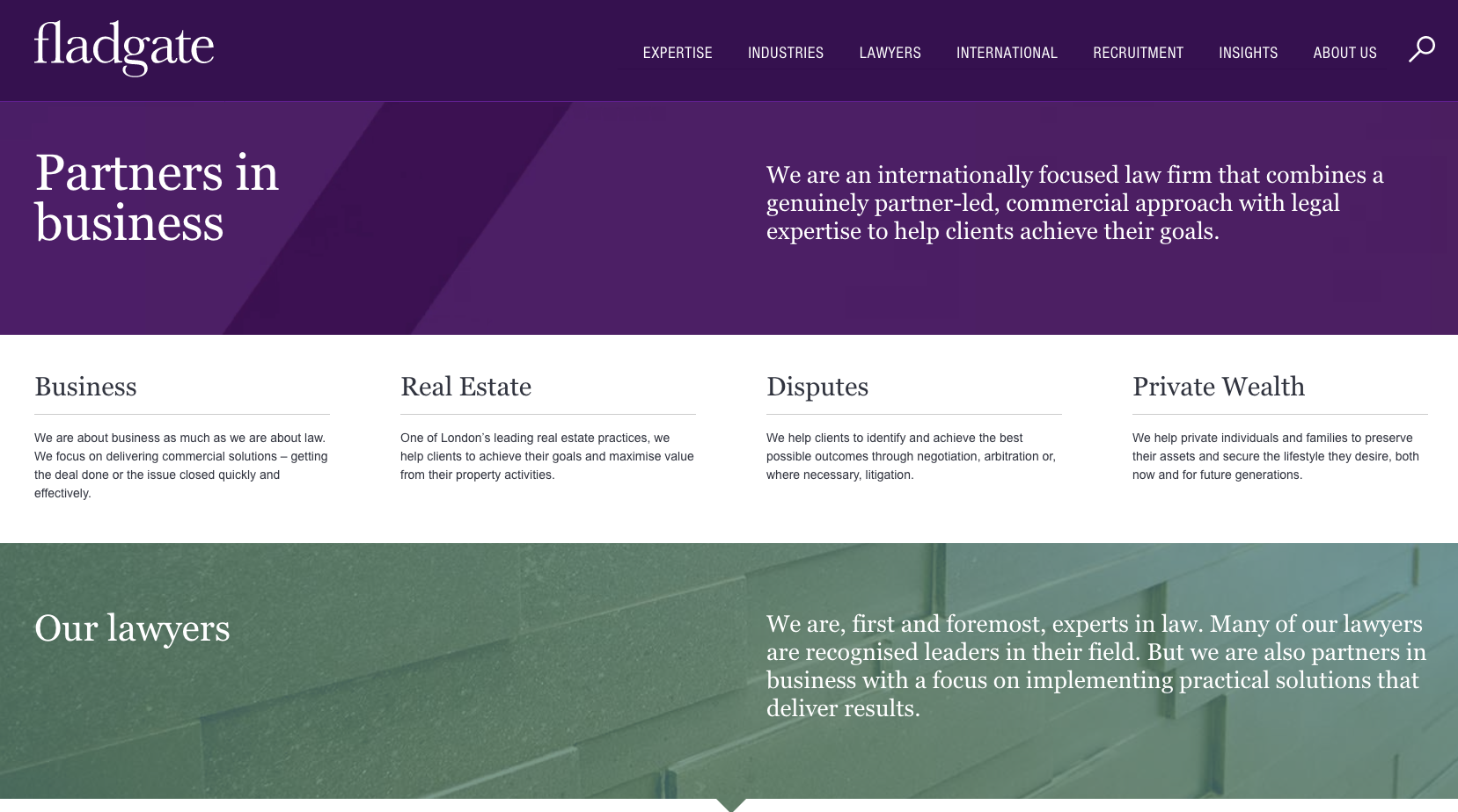
Fladgate use a structured layout with accessible push points and prioritised content which make the website easy to browse and navigate. The site uses a transparent positioning statement featured in the top panel, alongside routes through to the key business services offered by the firm. The home page also uses a subtle background animation which adds movement and gives the home page a dynamic feel.
62. Forsters

Forsters take an image based approach to their home page which includes clear positioning highlighting the firms 20 year history. Overall, the design is easy to navigate with a straightforward structure and uncluttered design. There is a good balance of text and images.
63. Lewis Silkin

The Lewis Silkin website features a video in the home page banner area which has a preview made up of bold colours and geometric shapes. This creates an engaging and interesting layout which also does a good job of re-enforcing their logo. There is a short positioning statement placed over the main image banner, with additional information being displayed below the line.
64. Maclay Murray & Spens
Maclay Murray & Spens has now merged with Dentons.
65. Clarke Willmott
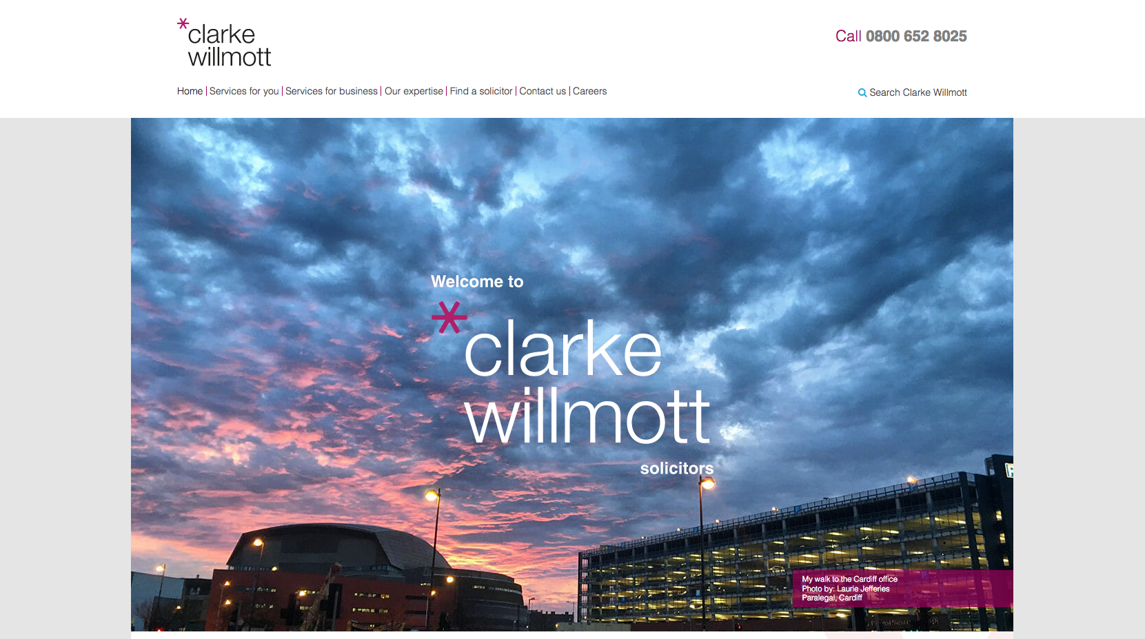
The Clarke Willmott website uses a striking background image and is easy to navigate due to it’s straightforward layout. Their positioning statement is presented clearly on the homepage. Below this is a large search bar with filtration options to direct users to the deeper areas of content on the website.
66. Dickson Minto
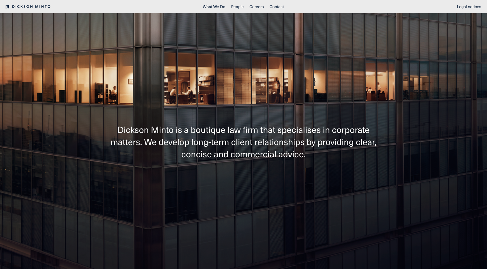
With a large scrolling banner featuring strong imagery, the Dickson Minto website has a really user-friendly layout. Their positioning statement is layered over the imagery, but it doesn’t offer further access to pages. Instead, the navigation panel at the top or the page allows users to navigate through to about, people, careers and contact pages.
67. Birketts
Birketts have a very straightforward website design with a pronounced statement which positions the website as a top 100 UK law firm. There are quite a lot of push points which pull the user towards key areas such as the people/content search bar and business and individual areas of the website.
68. Walker Morris

Walker Morris have a nicely branded website which follows their corporate colour scheme. The header banner has easily navigable tabs, which make access to the content straightforward, while the latest news and lawyers have been prioritised in separate panels of content underneath the banner.
69. Bristows
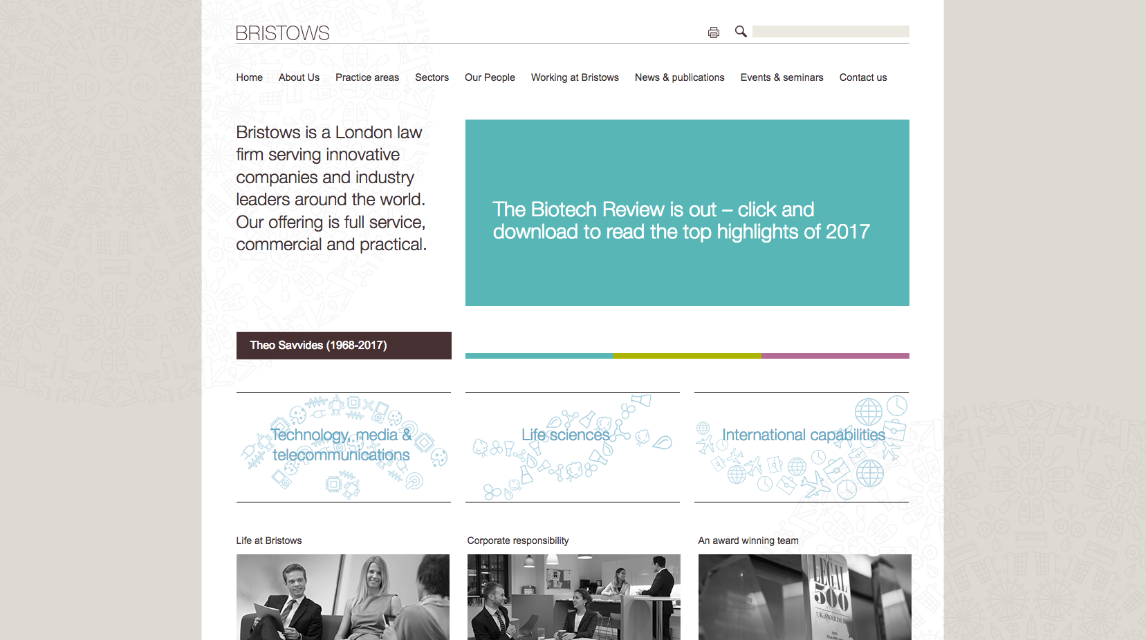
A concise website design with a transparent positioning statement. All of the information is easy to access with prioritised content featuring life at Bristows, corporate responsibility and about the firm which sits alongside three of their main sectors. It uses a very different colour palette compared to other firm’s websites.
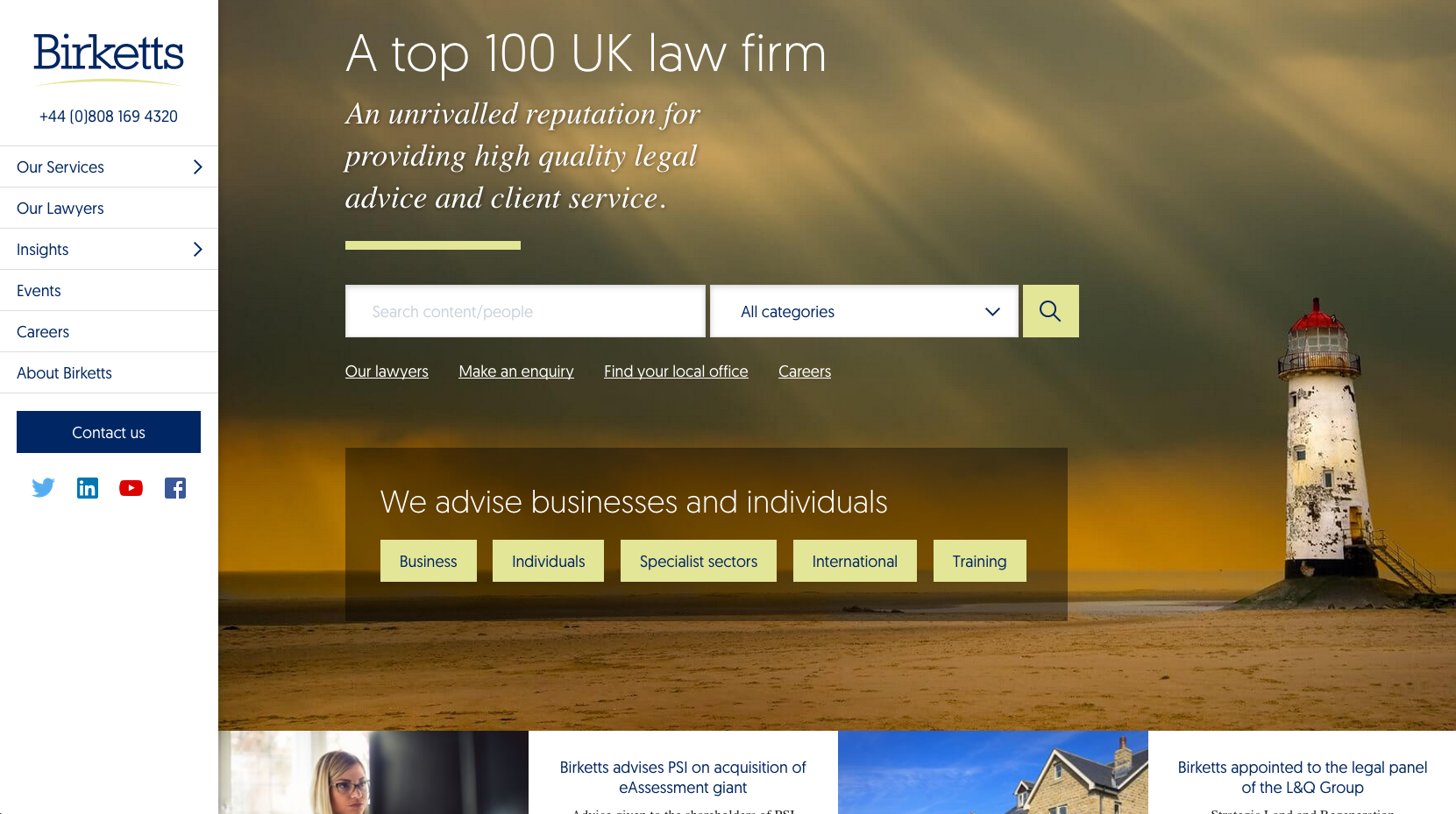
70. Ashfords
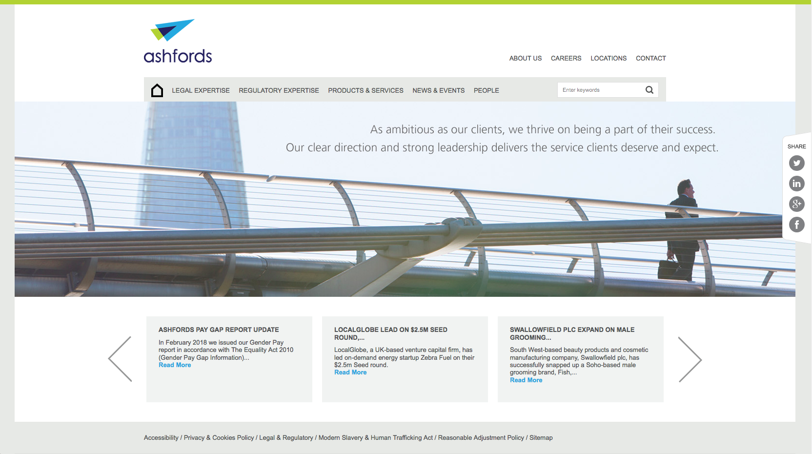
Ashfords have an uncluttered homepage with prioritised content showing the latest news. The firm’s obvious positioning statement has been placed prominently over the banner image while at the top of the page, there is an obvious navigation panel and search bar, making the website content easy to access.
71. Winckworth Sherwood

The Winckworth Sherwood website uses video, instead of a sliding banner which goes against the trend seen on many other top 100 UK law firms websites. Laid on top of the video are links through to the main pages. This is a uncomplicated website design, but with the video, it becomes very engaging.
72. Bevan Brittan
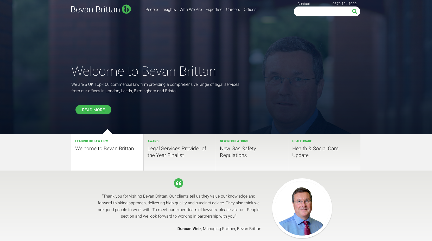
The banner image scrolls through subtle images with a blue overlay which displays the main news items. Below this is a quote from one of the managing partners, which acts as an alternative to a standard positioning statement.
73. Foot Anstey
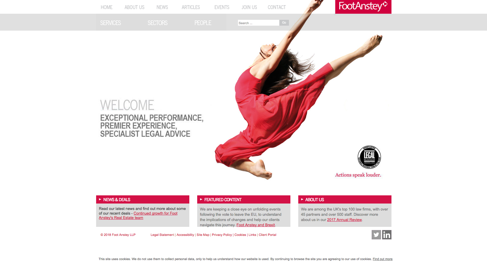
There is easy navigation on the top panel of the website which works well alongside the minimalist design. Their positioning statement is transparent while the imagery acts as a contrast to the brand.
74. Capsticks
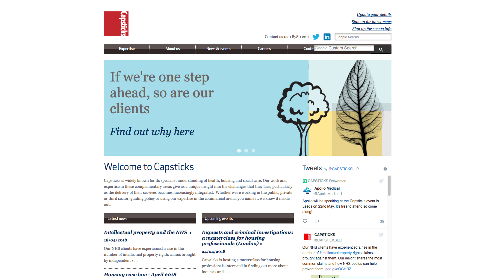
A basic website design which includes a main banner image with news comments and a twitter feed prioritised underneath. A transparent positioning statement and clear navigation header runs along the top of the page.
75. Hugh James

A simple yet engaging and eye-catching design. Their positioning statement is situated on the main banner alongside images of lawyers at the firm, while the strapline is featured just below the logo. The icons below the banner make it easy to navigate through to the different areas of the website.
76. Kingsley Napley
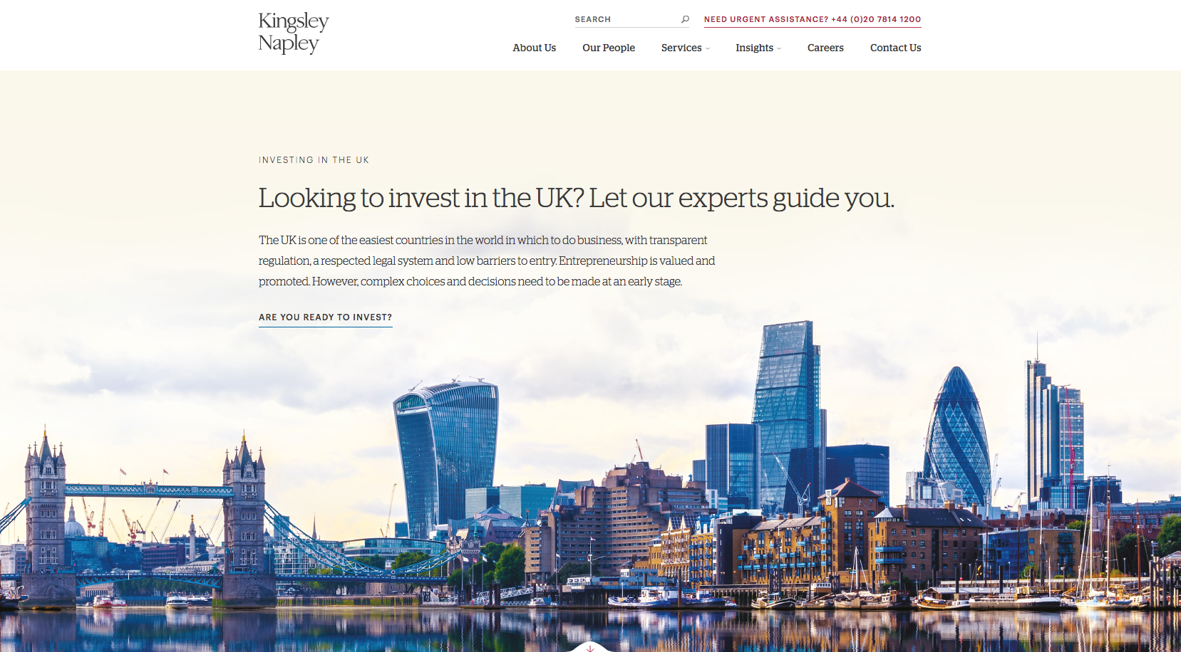
Kingsley Napely have a very large banner area which takes up the majority of the homepage, using interesting imagery and bold graphics. The layout and design is very easy to navigate while the navigation panel is concise and displays the key pages of content making the user’s journey more efficient.
77. Ward Hadaway
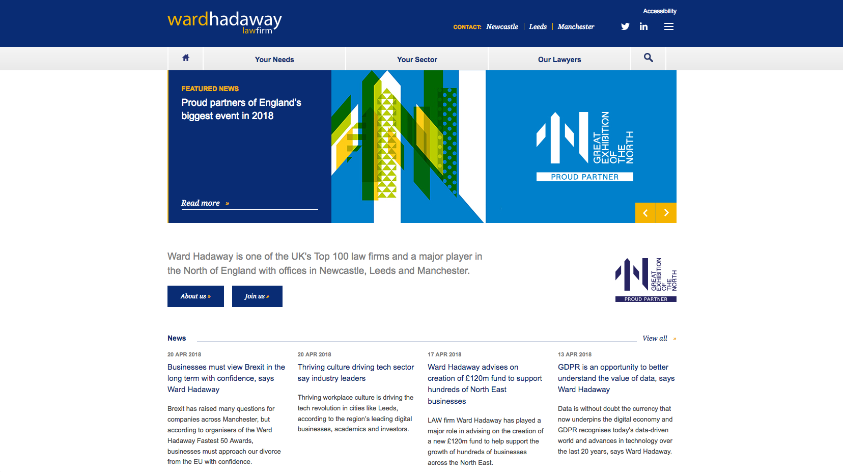
A professional website with a corporate feel to it. There is consistent use of the branding colours used throughout the website. The positioning statement is transparent and key content has been prioritised on the homepage.
78. Bircham Dyson Bell
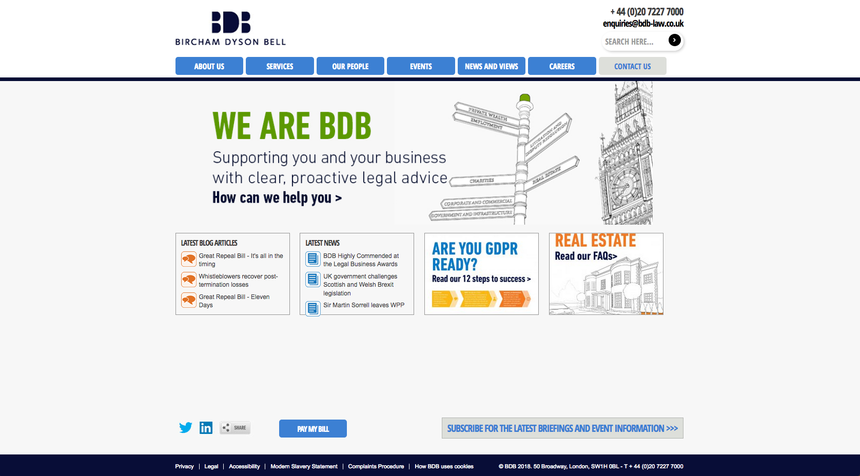
Bircham Dyson Bell have a very simple website design. It is easy to navigate with the banner header tabs and prioritised content under the header, which mainly focuses on news items. The website highlights certain content audiences may be looking for, including GDPR and Real Estate.
79. Michelmores

The Michelmores website uses a dark background and a bright contrasting colour to direct users through to calls to action. Below the banner image are links through to the various expertise and sector pages which then flows into news content.
80. Russell Cooke
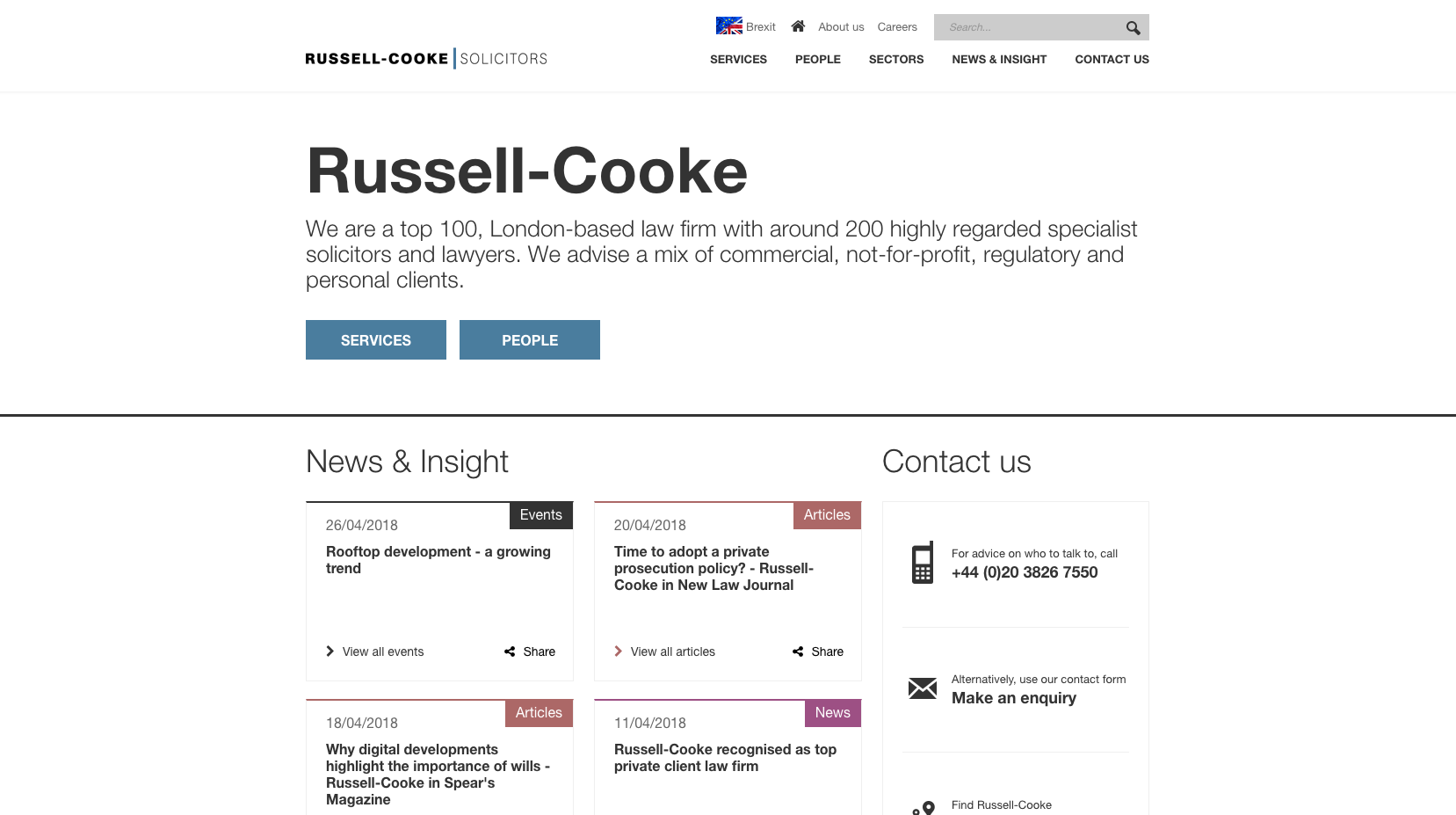
An easy to navigate website with a white background and bold font. It doesn’t use images in the design which keeps the design very clean. The positioning statement is well positioned, being placed in the centre of the page, making it the first piece of information you read when accessing the site. The key areas have also been prioritised making the website easy to navigate.
81. Wedlake Bell
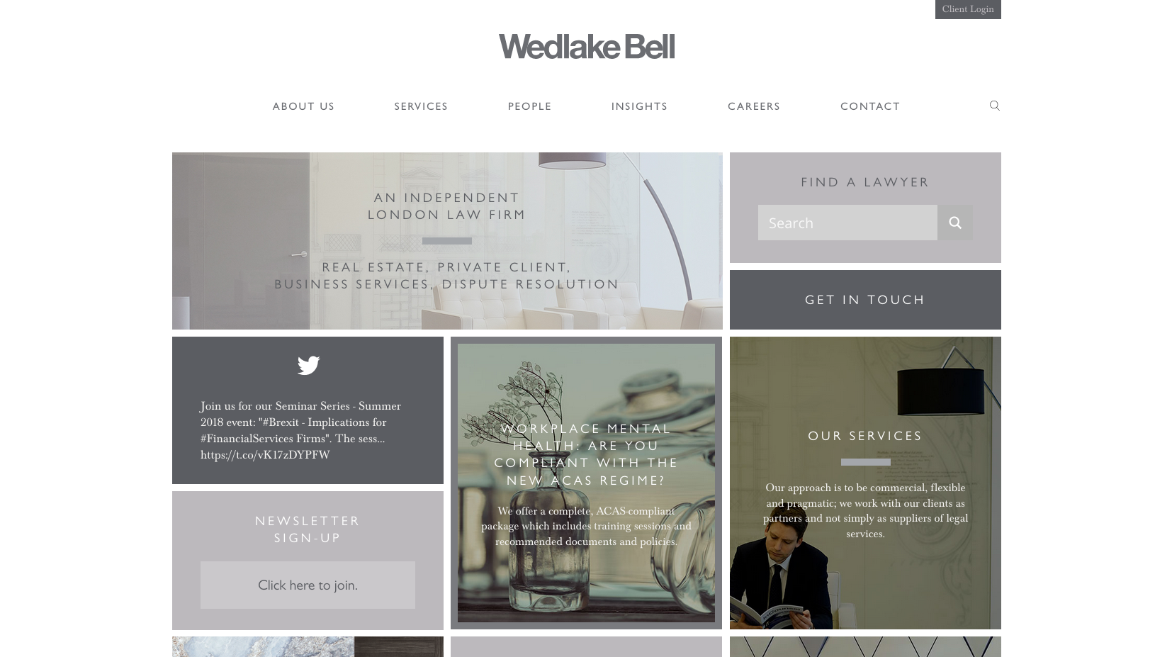
Wedlake Bell use a block style layout which is different to many of the other law firm websites. The muted colour scheme flows with the use of imagery. Each of the blocks directs users through to different areas of the website, such as news, services and contact pages.
82. Knights

Knights have implemented an uncluttered website design with visible push points through to the main areas of the website. There is also a positioning statement displayed on the banner area, while the rest of the content is hidden with a burger menu. To help build confidence there is a scrolling panel of quotes from Knights clients.
83. Simpson Millar
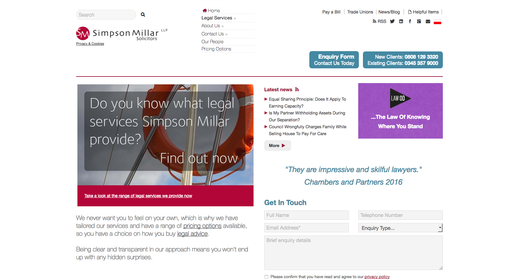
The Simpson Millar home page contains a lot of content compared to may of its competitors. They don’t use a sliding banner across the width of the website, instead, it is positioned to the left side of the homepage. Alongside this is a quote from Chambers and Partners, with a contact form.
84. Veale Wasbrough Vizards
Veale Wasbrough Vizards have a very professional looking website with pull points for the user to go through to sectors, business legal advice and personal legal services. Their banner image also shows a transparent positioning statement.
85. Royds Withy King

The Royds Withy King website uses their design to reflect both the logo and strapline. Underneath the main banner image, their content is filtered to either business or personal services, with the option to also navigate through to the lawyer profile pages.
86. Thrings

The Thrings website focuses on personal imagery used within their sliding banner. On top of this banner image visitors are directed through to either people or expertise pages. The top-level navigation panel is hidden in a burger menu, which keeps the design clean and minimalistic.
87. Cripps

Cripps use a simplistic design for their website. They offer a positioning statement alongside their prioritised news content. Below this, the homepage follows into a statement about working at Cripps and then filters through users to content aimed at individual or business clients.
88. Brabners
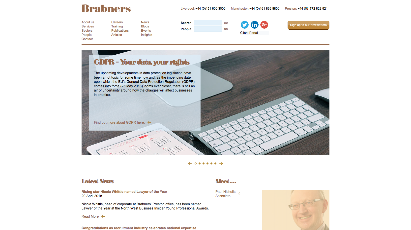
The Brabners site contains scrolling banner images which contain quite a lot of text. The top-level navigation panel also has quite a few pages displayed with a search bar and people search toolbar.
89. Harrison Clark Rickerbys

Harrison Clark Rickerbys have an uncluttered website design with a static homepage banner directing users through to one of their resources. Below this panel is the footer which displays a testimonial for confidence building, links through to further resources, careers and office telephone numbers.
90. Digby Brown
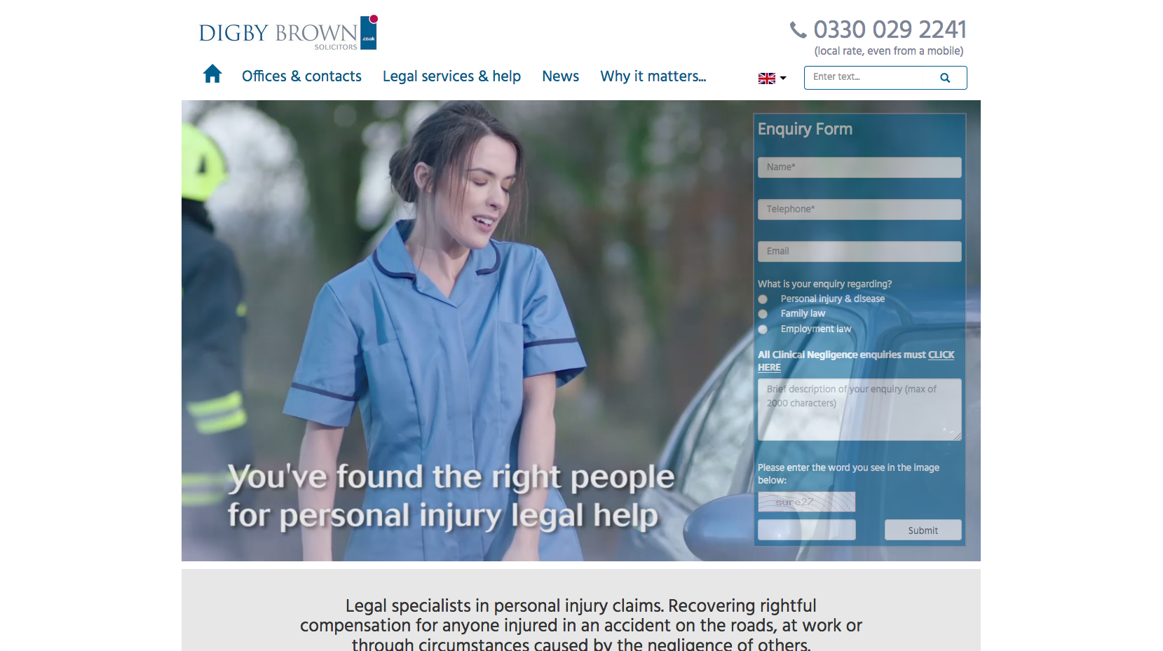
Digby Brown use video in their banner space, alongside a contact form that fades until you click on it. This helps it appear to be a little less intrusive. There is a panel below displaying both the firm’s strapline and positioning statement.
91. Harbottle & Lewis

The banner image panel is only half the width of the homepage, so underneath there is room for the full-width search panel and news content. The banner image contains a strapline and positioning statement, while the other images link through to news items.
92. Sackers
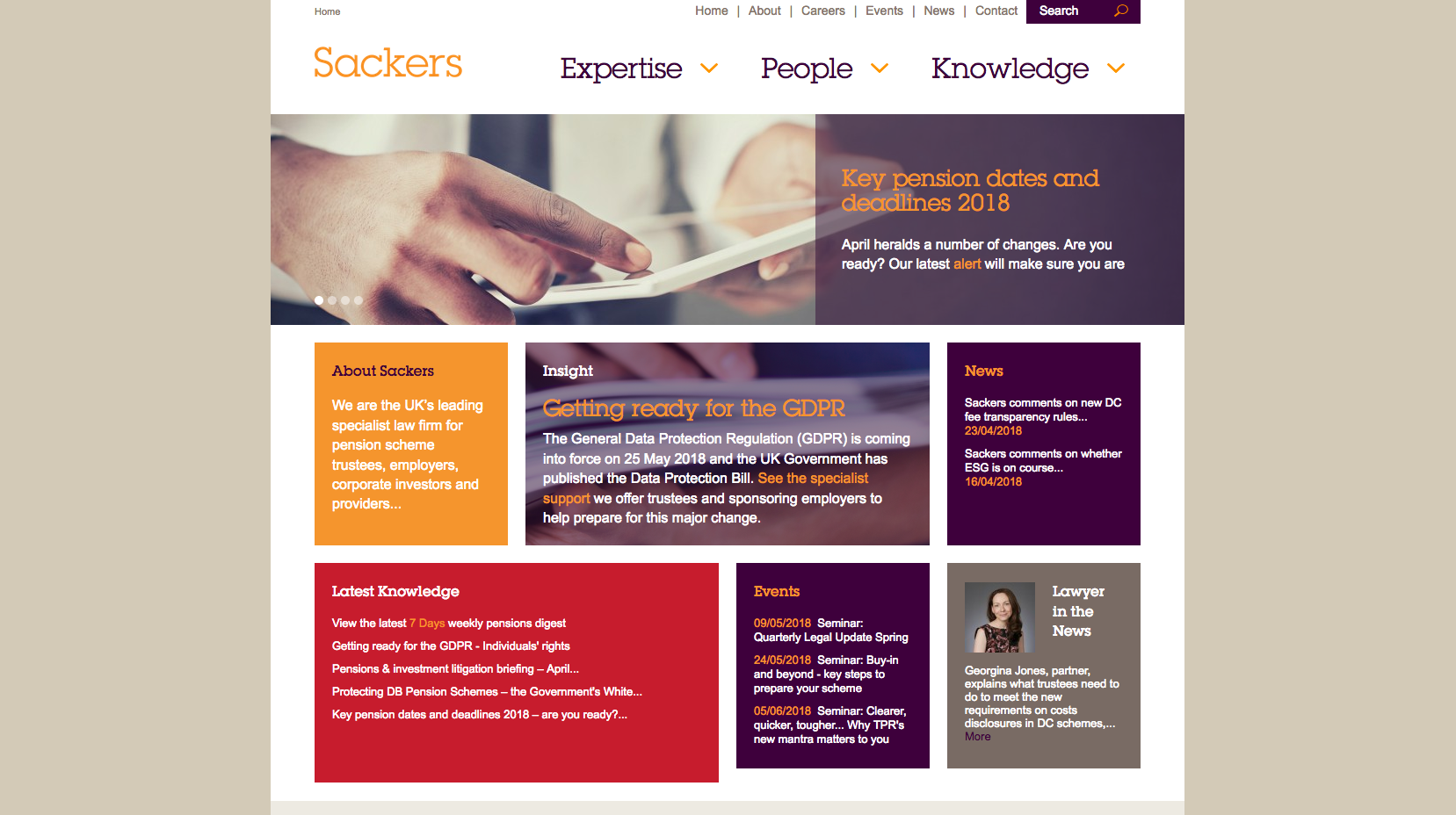
The Sackers website has a block style design with each panel directing users through to different areas of the website. There is a clear focus on content pushing through to news, events and knowledge-based content. The top navigation panel contains drop-down menus for the three main areas of the website: Expertise, People and Knowledge.
93. Harper Macleod

A corporate looking website with no images featured on the homepage. Their sliding banner features content surrounding their success and latest news, while the information underneath contains a transparent positioning statement.
94. Keystone Law
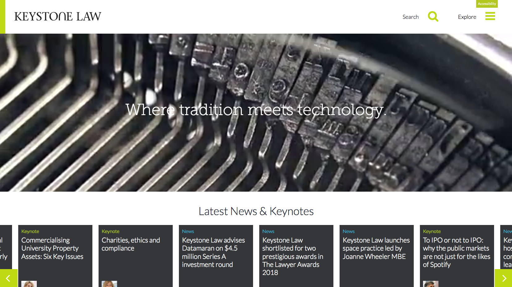
The Keystone Law website uses video behind short straplines that help position them as a modern firm. Below this, there is a focus on latest news items. The rest of the navigation panel at the top of the page is hidden in a burger menu.
95. MW Solicitors
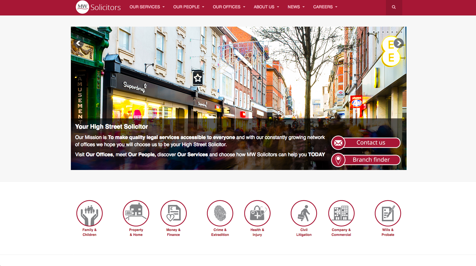
The sliding banner image take users through to all the main areas of the website, filtering users from personal to business services. Underneath the banner area are also icons directing users through to the different practice areas.
-96. DMH Stallard

DMH Stallard have a clean homepage design with very striking imagery in their scrolling banner. Key content has been prioritised with obvious calls to action. The website is easy to navigate and offers a good user experience.
-96. JMW
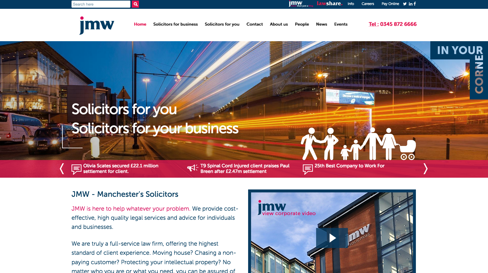
Rather than implementing a sliding banner image, the JMW website has a sliding news panel underneath the main banner area. The positioning statement is featured below this area with a video showcasing the firm. The content is then filtered through to personal and business services.
98. Stevens & Bolton
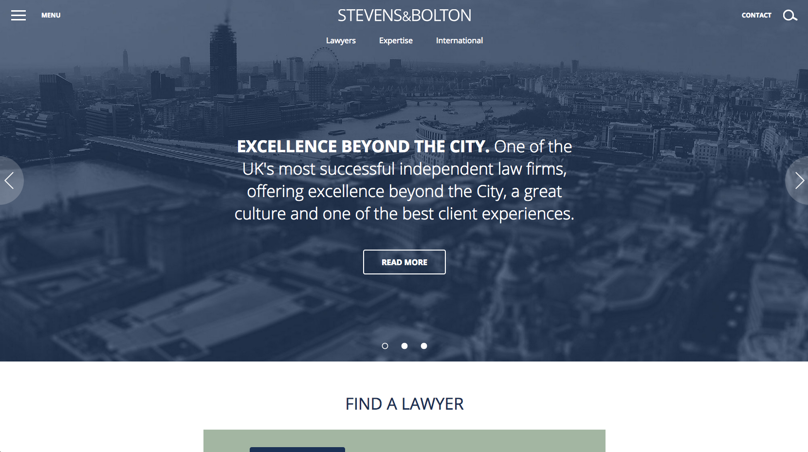
Stevens & Bolton have a simple but professional looking site which uses striking banner imagery and their blue branding colour. They have given priority to their positioning statement, lawyers and the latest news.
99. Moore Blatch
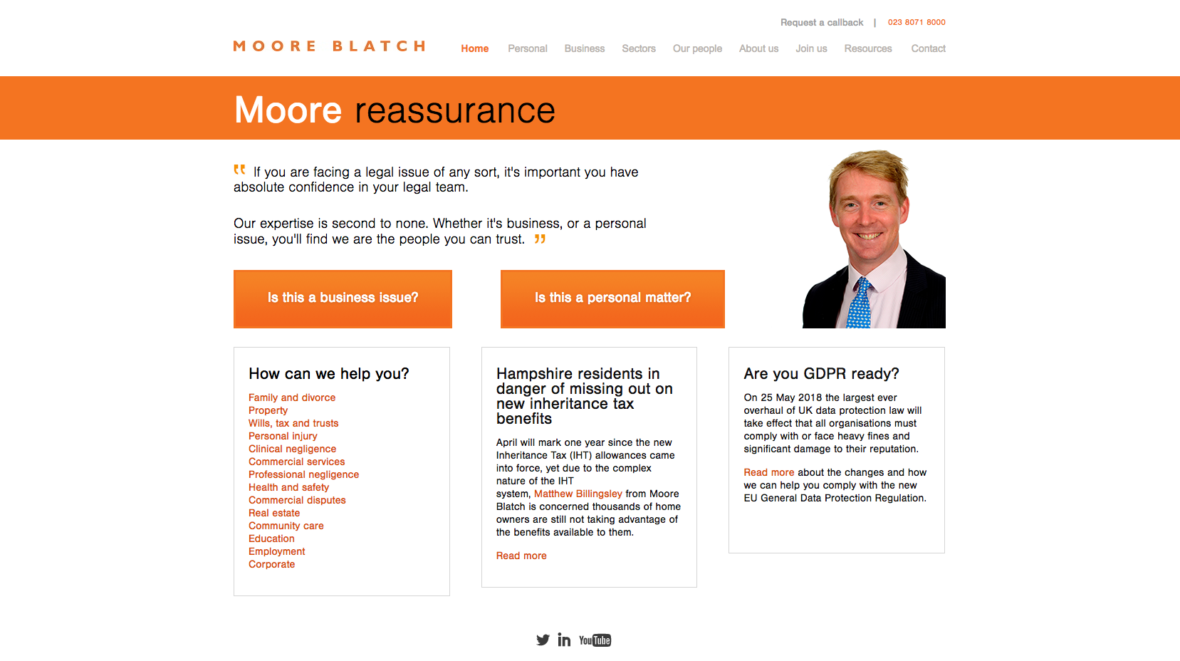
Moore Blatch have quite a lot of copy on their website home page which also has a heavy focus on their brand colours. They clearly filter the users through to content with the main business or personal content calls to action. There are also rotating quotes in the banner space which help to build confidence.
100. Bates Wells Braithwaite
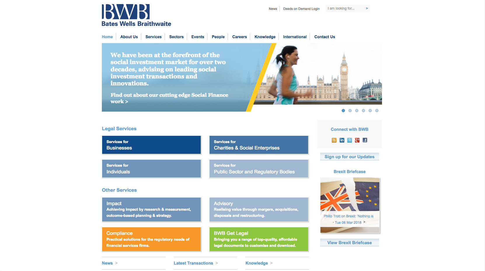
The final website of the top 100 UK law firms is Bates Wells Braithwaite. Their website is another simple design with a sliding banner giving further information about the firm. There are also calls to action in blue boxes underneath which direct users through to the legal services provided by the firm