
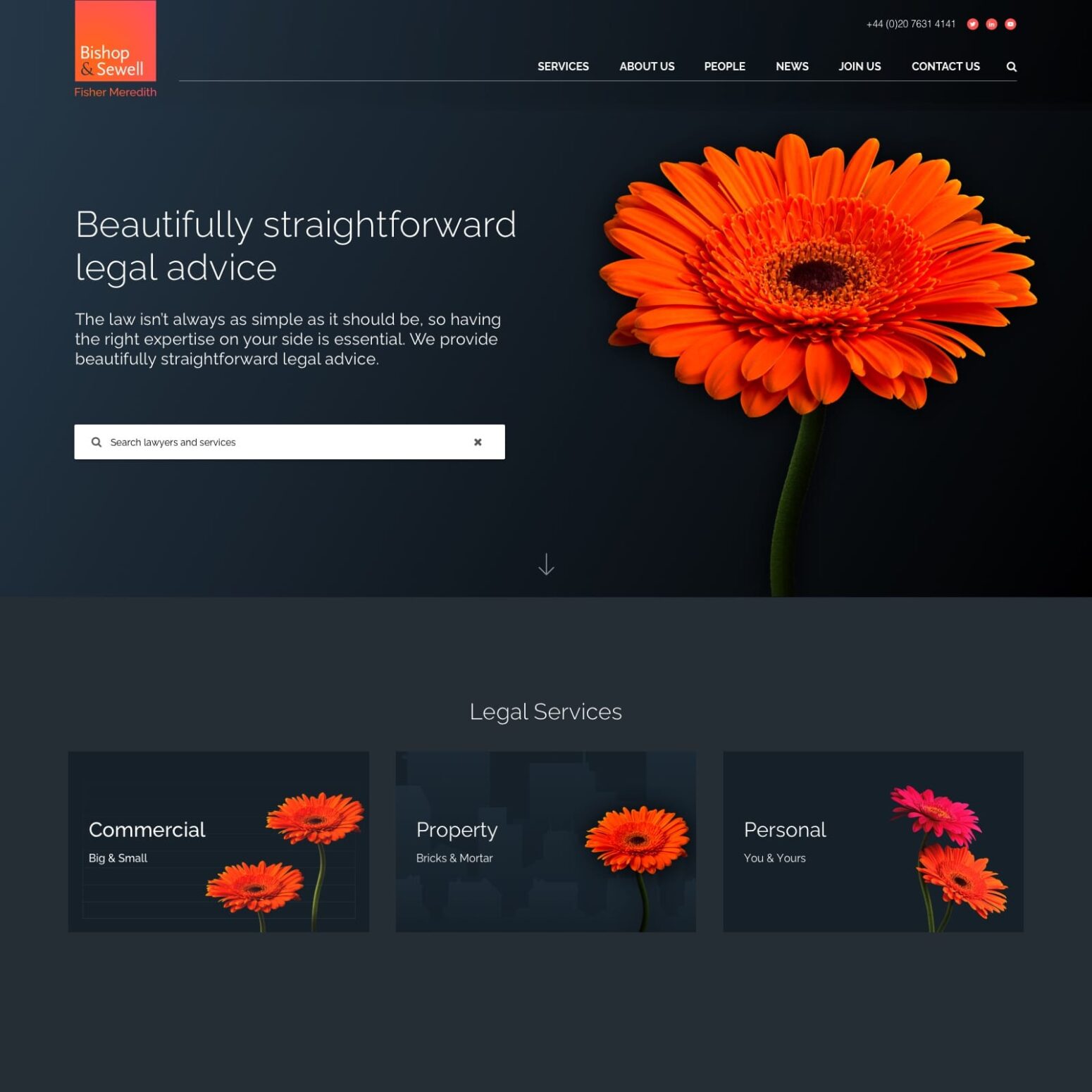
Bishop & Sewell
As a result of the merger between Bishop & Sewell and Fisher Meredith, a new website was created to amalgamate the two existing firms offerings, whilst creating a structure and digital strategy that worked with the combined brands. Taking into consideration the new brand design and guidelines, User Interface (UI) and User Experience (UX), a new strategy was created to allow for opportunities to introduce new, client-focused functionality.


Objectives
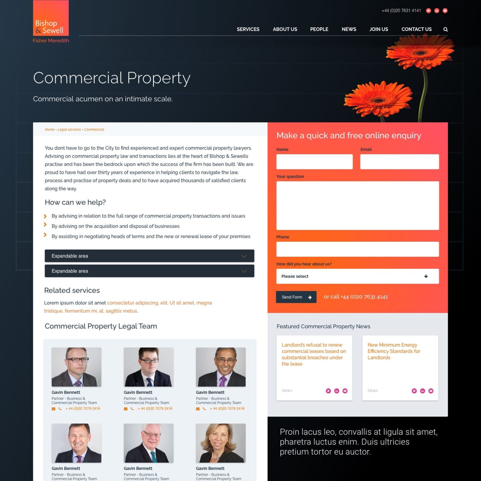
The new Bishop & Sewell website needed new page templates that would complement the new branding and improve the brand perception. Restructuring the website’s architecture would allow users to easily navigate their way through the website and find the key business service pages. Therefore it was key that a strategy was developed focussing on funnelling users through to the correct areas of the website. This would help maximise the value of each page, working hard to convert traffic with clear calls to action.
Result
Tela upgraded the technology behind the Bishop & Sewell website which allowed for different areas of the website to be optimised for the user journey. The higher levels of functionality give the new website opportunity to enhance the user experience and give the firm a chance to differentiate themselves, while serving content to the core target audiences. The website now works harder to encourage users to complete specific actions, as more intricate relationships have been set up between the different types of content on the website.
As a lot of content needed to be amalgamated between the two existing websites, tela set up redirects to help maintain and increase the search engine rankings.