The power of colour psychology in legal branding
Thursday 16th April 2026
In a sector founded on trust, authority and credibility; the colours you choose for your legal services website can significantly influence how clients and visitors perceive your practice. Colour has the power to communicate professionalism, expertise and reliability before a single word is read.
The principles of colour in legal branding
In the legal sector, branding must strike a careful balance between authority and approachability. The colours a law firm chooses will naturally shape how potential clients feel about the firm’s values and level of expertise.
The right colour palette can reinforce trust and differentiate a firm in a competitive marketplace.Understanding how colour psychology works allows law firms to build brands that not only look professional but also communicate the right message to their target audience.
Understanding the psychology of colours in law
Below is an overview of commonly used colours in legal services branding, the perceptions typically associated with each, along with examples of legal brands that incorporate them into their visual identity.
Red
Red is associated with passion, strength, power and urgency, communicating confidence and boldness when used in legal branding.
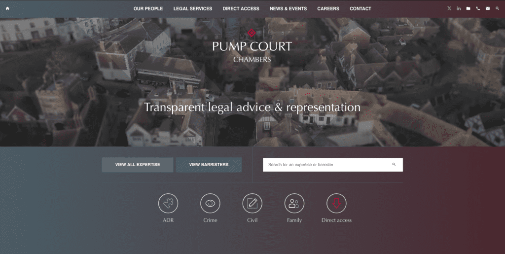
Law firms like Pump Court Chambers use red as an accent colour to draw attention to key elements such as important headings. When balanced with more neutral tones, red can add authority and impact without overwhelming the brand.
Orange
Orange conveys enthusiasm, energy and creativity. It is less traditional in the legal sector but can work well for modern, forward-thinking firms or those specialising in areas such as media or technology.
The Bishop & Sewell website uses orange well to convey warmth, approachability and confidence, helping to balance professionalism with a more personable and client-focused feel.
Yellow
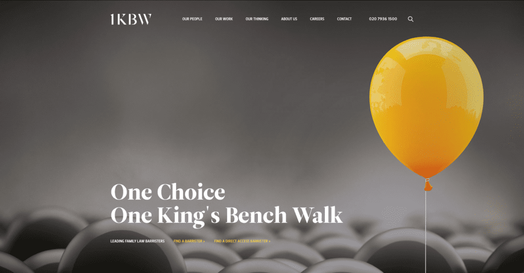
Yellow represents optimism, clarity and positivity and in legal branding it can convey transparency and a client-friendly approach. However, because it is such a bright and attention grabbing colour, it is rarely used as a dominant primary shade. Many legal brands opt for darker or more muted tones to introduce warmth and distinction without overwhelming the user. For example, in 1KBW’s branding yellow is incorporated thoughtfully, including the balloon imagery on its homepage, to create a sense of approachability while maintaining professionalism.
Green
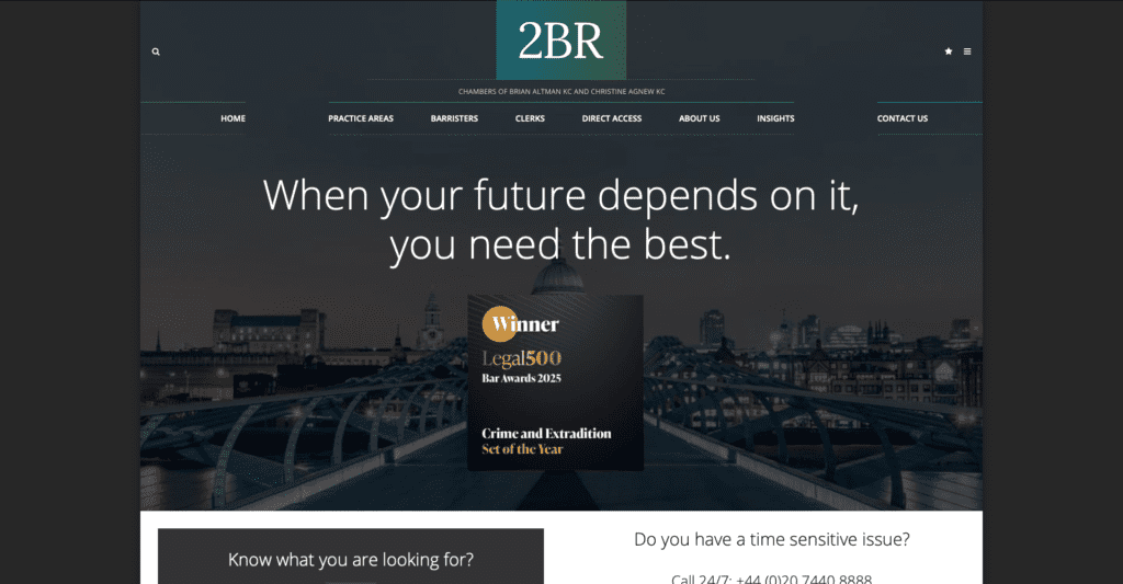
Green symbolises growth, balance, stability and reassurance. The colour is used frequently in criminal barristers chambers 2 Bedford Row. They specialise in Criminal, Fraud, Health & Safety, Regulatory and Sports law.
Green could be particularly effective for firms specialising in environmental law, agriculture, property or private client services as the colour conveys growth, stability and wealth.
Blue
According to research into logo colours used by the top law firms, blue currently appears more often than any other colour in logos across the UK legal sector. It is strongly associated with trust, intelligence, responsibility and professionalism. Lighter blues can feel modern and approachable, whilst darker blues convey authority, experience and corporate strength.
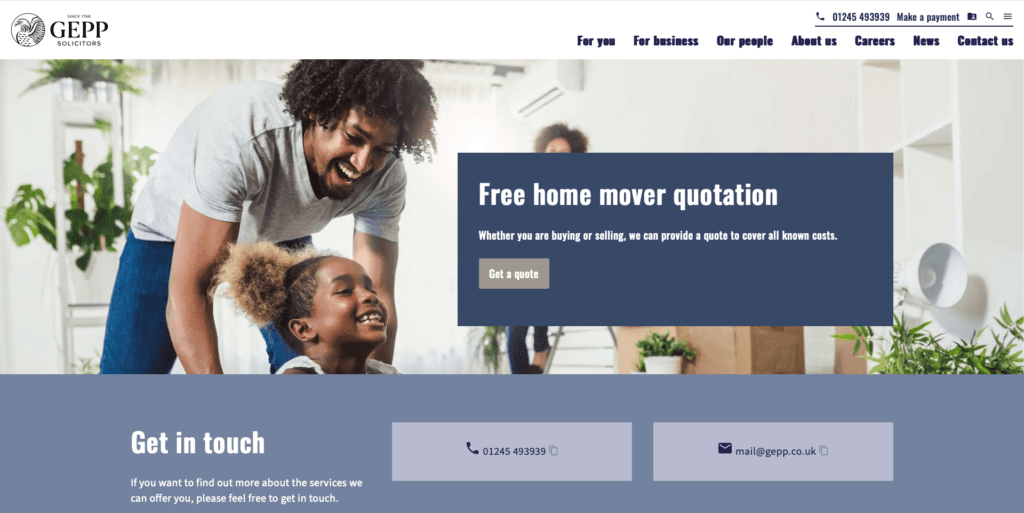
For example, Gepp Solicitors use blue on their website and in their branding to convey trust, professionalism and reliability, reinforcing their credibility with clients.
Purple
Purple conveys wisdom, prestige and sophistication. Historically associated with royalty and power, it can suggest seniority and high-level expertise. Lighter shades may feel more creative or boutique, whilst deeper tones project luxury and exclusivity.
7KBW
7KBW is a commercial set of chambers that uses purple as its primary branding colour, complemented by beige, cream, muted blues, greens and greys.
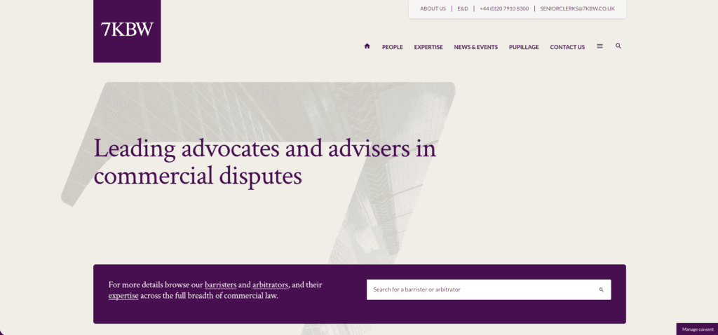
As a Top 50 barristers’ chambers, 7KBW leverages purple to convey class, prestige and a sense of royal authority, reinforcing its reputation for excellence and high-level expertise in commercial law.
Black
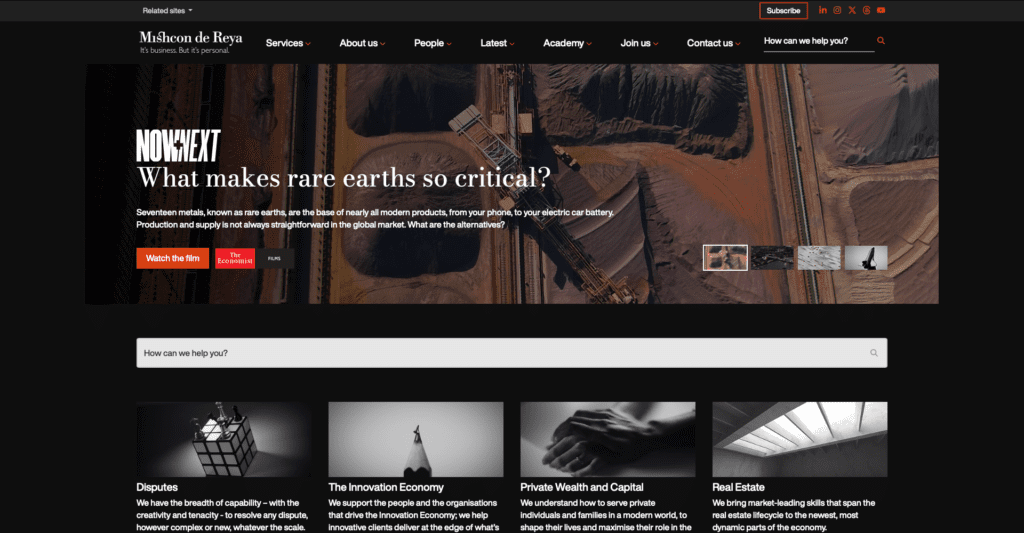
Black communicates authority, sophistication and strength. In legal branding it can create a powerful and premium impression. Many chambers like Mishcon and high-end firms use black prominently to project seriousness and confidence.
However, too much black can appear severe or unapproachable. Mishcon De Reya uses bright orange accents and vibrant imagery on their website to break up large areas of black.
White
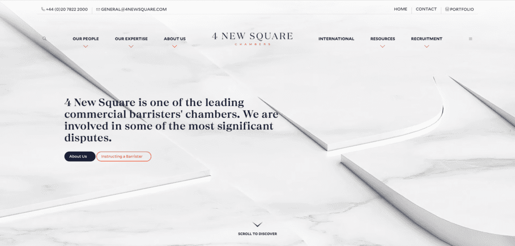
White symbolises clarity, transparency and simplicity. In legal branding, white space is particularly important. It enhances readability, creates a modern aesthetic and gives a sense of openness and honesty. An example of a firm that uses white as a base colour is 4 New Square.
Final Thoughts
The power of colour psychology in legal branding should not be underestimated. The right colour palette can strengthen your legal branding identity, build trust with clients and clearly communicate your values.