Top 50 barristers’ chambers websites
Sunday 11th March 2018
Tela has researched the top 50 barristers’ chambers websites by taking screenshots of each of their homepages. The research has been completed to benchmark the top 50 barristers’ chambers websites in 2018 which offers opportunities to identify digital trends within the legal industry.
Please note, this is a research piece. Not all of the top 50 barristers’ chambers websites have been designed and developed by Tela. The screenshots of each website were taken in September 2018.

So who are the top 50 barristers’ chambers in 2018?
The following list, ordered by number of rankings, was originally compiled in 2018 by Chambers and Partners. Tela have added an extra column to the table in order to display the number of QCs present in each Chamber. This information was taken manually from each of the top 50 chambers’ websites.
A review of the top 50 barristers’ chambers websites 2018
1. Blackstone Chambers

First of the top 50 barristers’ chambers is Blackstone Chambers. Upon first glance, it is clear that there is a strong focus on the search facility which is positioned in the centre of the homepage. This clearly helps direct visitors through to the correct areas of content by giving them an opportunity early on in their journey to search for a barrister or click through to one of the key practice areas.
The quote “Chambers of the Year” in the centre of the home page will help to build confidence with people visiting the website, as it positions Blackstone as one of the leaders in their field.
News and case-based content is given prominence on the home page under the search facility and practice area links which helps the chamber promote the latest publication based content.
2. Fountain Court Chambers
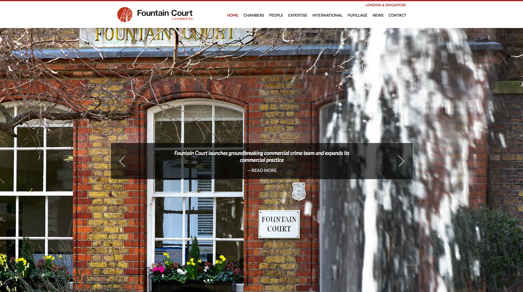
Fountain Court Chambers focus their homepage on an image showing the location of their building in the Temple, central London. A scrolling banner of quotes overlays the image and is used to display confidence building messaging. Underneath the large image is direct links through to the areas of the website: Our Chambers, Our People and Our Expertise, followed by two panels which are being used to display the latest news articles.
3. 39 Essex Chambers

The 39 Essex website design features a consistent colour scheme which is reflected in the branding and throughout the site. The lead homepage image is made up of photos of each of the sets locations, London, Singapore and Kuala Lumpur which demonstrates to visitors as soon as they arrive on the site that 39 Essex have an international reach. Calls to action are positioned in eye-catching blocks under the main scrolling banner images.
As you move down the homepage, a sticky navigation header stays in place giving quick access to further areas of the website as well as offering access to contact details at all times. Imagery focused on awards and links through to content focused content international law, help portray a message of success and an international reach.
Towards the bottom of the home page, news and a feed from the 39 Essex Twitter page offered a mixture of case, seminar and social publication based content to visitors.
4. Brick Court Chambers
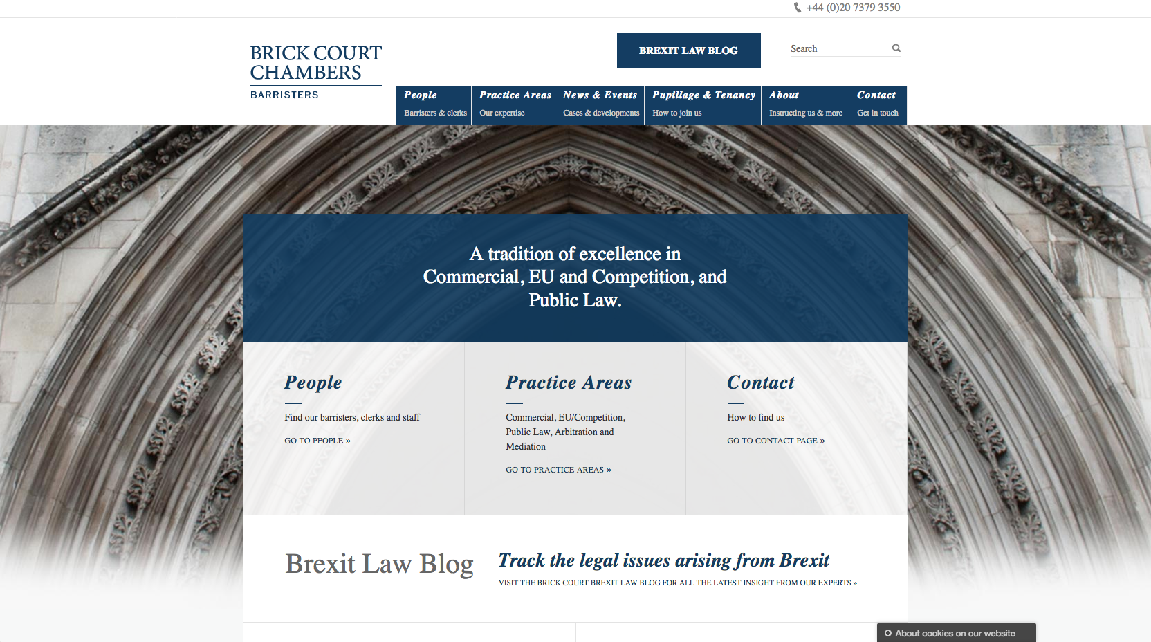
The Brick Court website leads with a statement which establishes the set’s experience in a number of key practice areas. A series of blocks are used on the homepage to highlight important areas of information, including links to People, Practice Areas and the Contact page.
A prominently positioned panel highlights a blog focused on Brexit content, which demonstrates specialist knowledge and expertise in this area of law. Towards the bottom of the home page, visitors can search for a barrister by name, seniority or by practice area, as well as viewing the latest news and cases from the chamber.
5. Matrix Chambers

Matrix Chambers have employed a striking, minimalistic style on their website homepage. It features bold branding using the name of the chamber which has imagery scrolling behind each of the letters. Next to this is a strapline and positioning statement which highlights the chambers as a leading set with an international reach.
Further down the page are a series of panels which make good use of the imagery and the branding colours. The content directs users through to key content including Practice Areas, News items and Staff Profile content.
6. Essex Court Chambers
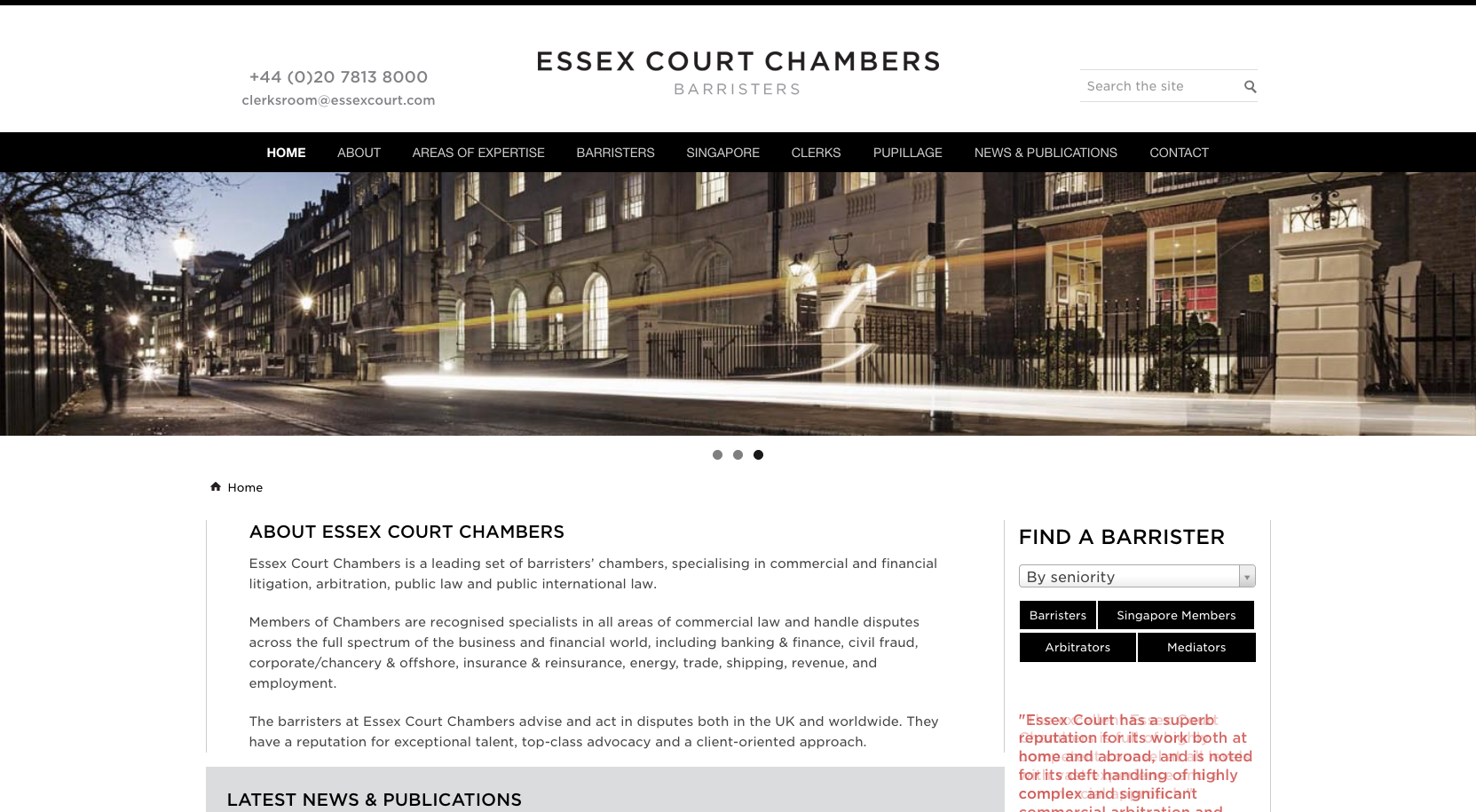
Essex Court Chambers use a straightforward website homepage design, with a scrolling banner and information about the chambers situated below. To the right is a barrister filtration facility which offers the option to view by a series of tags, including Barristers, Singapore Members, Arbitrators or Mediators. This approach highlights, and will help drive traffic to barristers with experience in Singapore, Arbitration or Mediation, alongside the more standard route which allows visitors to view all of the barristers in the chamber.
A panel displaying four news items is also displayed on the home page along with a rotating banner of quotes, taken from a number of legal directories.
7. Doughty Street Chambers
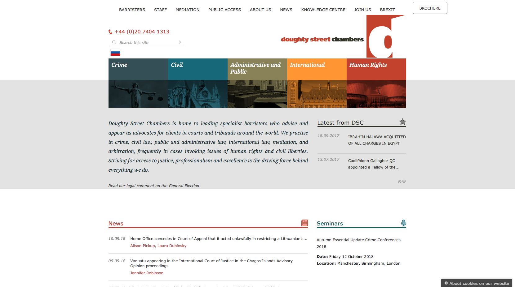
The Doughty Street Chambers website has two navigation panels. The top panel contains links through to the different areas of the website, while the panel below highlights and links through to some of the key practice areas and their sub-practice areas. A short description of the chamber is displayed below which helps position Doughty Street as a leading set.
To the right of the positioning statement is a scrolling news banner, which displays key success stories, dating back a few years, in the practice areas they specialise in. A traditional list of news and seminar content is displayed towards the bottom of the home page.
=8. Wilberforce Chambers

Taking a slightly different approach to its competitors, the Wilberforce website does not display any news or publication based content on the home page, or highlight access to the barristers’ profiles. This simplified structure has meant that there is no need to scroll to view further content on the home page.
Wilberforce use cityscape imagery in the scrolling banner displayed across the homepage of while prominent messaging highlights key quotes and success stories that will build confidence with visitors. Key areas of law the chamber specialises are displayed in different coloured panels which stand out against the background imagery.
=8. Kings Chambers
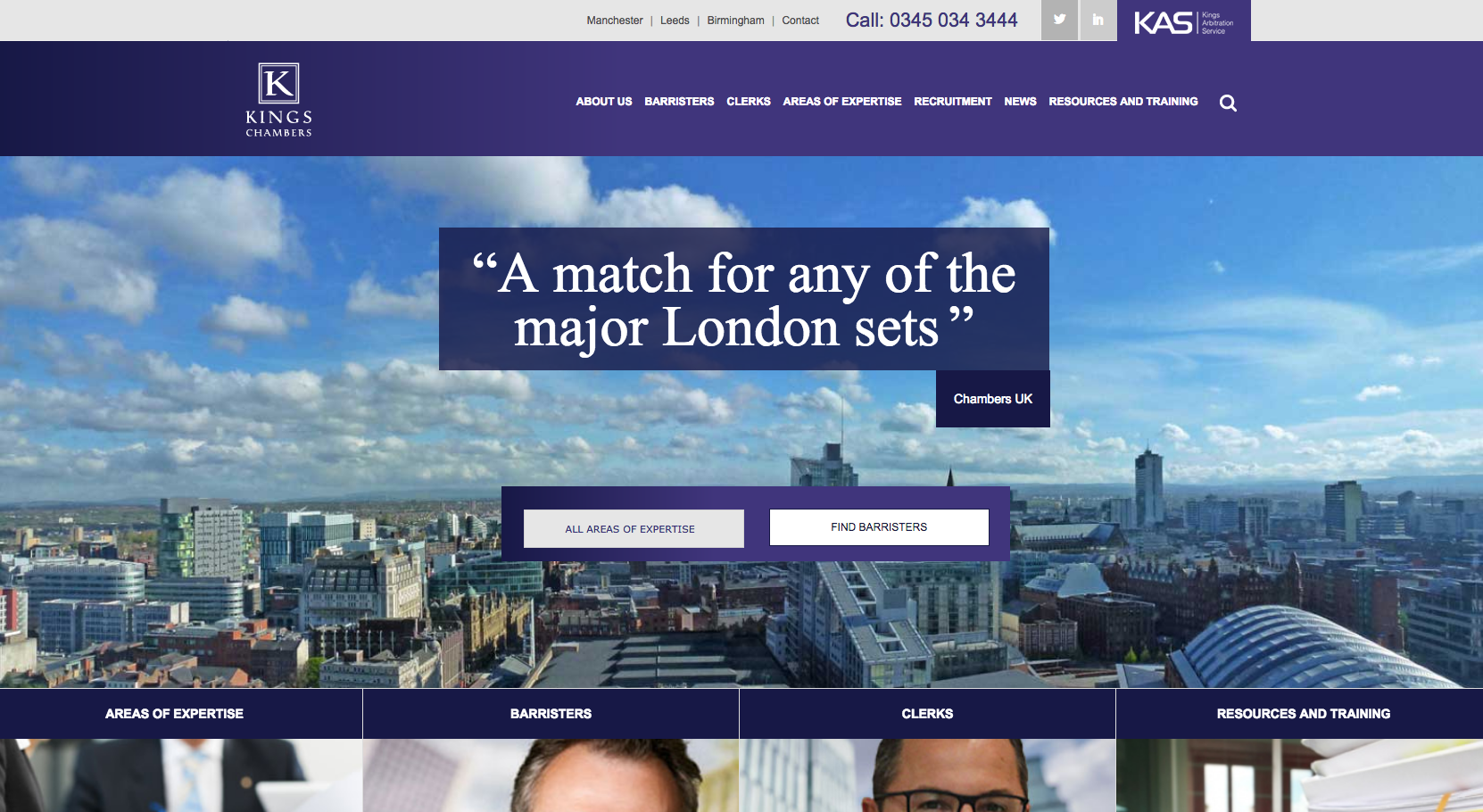
Kings Chambers follow the trend of using strong imagery in the scrolling homepage banner with quotes to help build confidence and position the organisation as a leading regional set. The imagery shows cityscapes of Manchester, Leeds and Birmingham, each of the regional locations in which the chamber is based.
Below the banner, prominently positioned calls to action link through to the areas of expertise and barristers listings, which will help drive traffic to these key areas of content.
Moving down the homepage, links to Areas of Expertise and Barristers are highlighted again, alongside clerks, resources and training content. The Kings website also dedicates several large panels on the homepage to different types of news content. This includes a ‘Spotlight’ panel which is given more prominence in order to draw attention to a key topic.
10. No5 Chambers
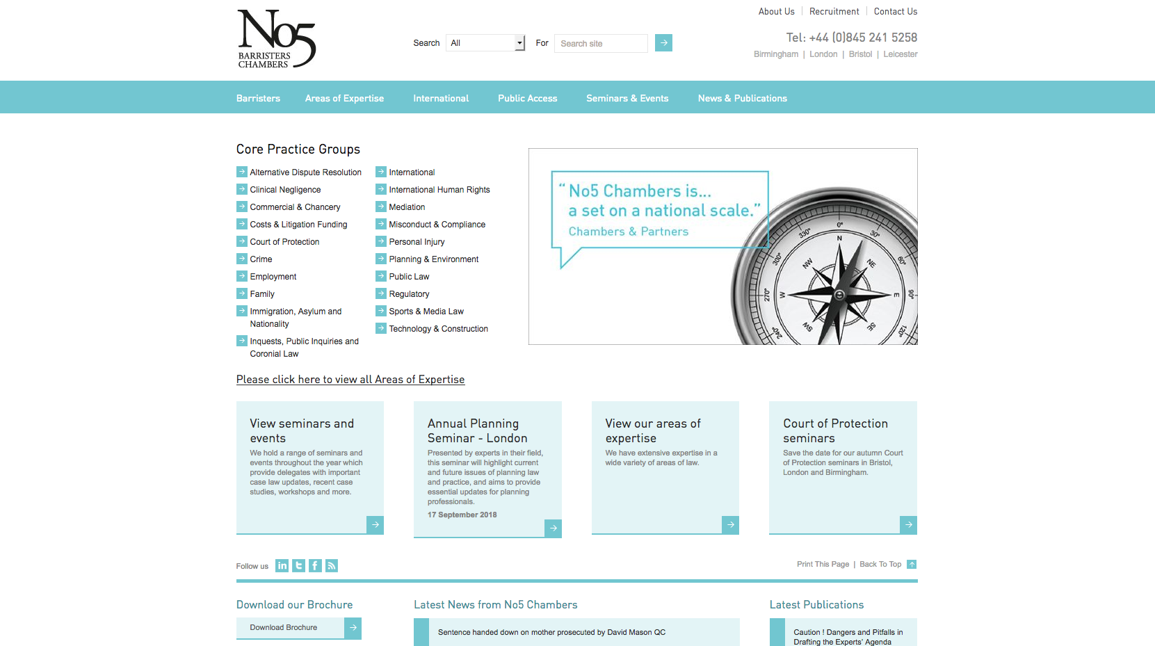
The No5 Chambers website homepage contains quite a lot of text compared with many of the other top 50 barristers’ chambers websites. With the core practice areas displayed in a list to the left and a small scrolling banner that displays quotes and event details, there is a lot of information all displayed on the page. There also seems to be a focus on event content which is prominently featured in blocks underneath the practice area listings.
11. One Essex Court
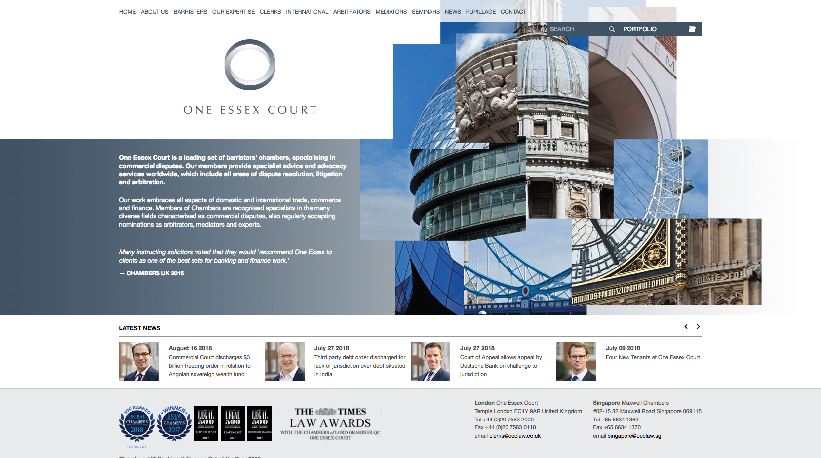
One Essex Court use a striking image of key landmarks in London placed together to reflect the logo of the chambers. Next to this is a short description of the chambers with a quote to help build confidence. News content is prioritised underneath to show supporting content that will again build confidence in the chambers.
12. 3 Verulam Buildings

The 3 Verulam Buildings website employs prominent imagery and a minimalist colour scheme to match the black and white logo of the chambers. Calls to action are highlighted using navy blue buttons which take visitors through to barristers profiles and news content.
The prominent search bar gives users a quick route to access barrister profiles while further down the homepage, a panel displays three latest news articles and an option to navigate through to view all news.
13. Serle Court
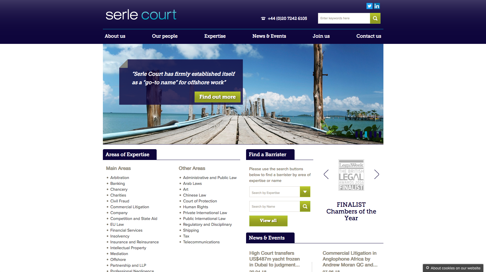
The Serle Court website has a simple, non-mobile responsive homepage design. The banner area displays a variety of imagery which reflects the rotating brand messaging. Each of the calls to action are highlighted in bright green to encourage you to ‘Find a Barrister’, or click on one of the links through from the scrolling homepage banner.
Areas of expertise are listed under ‘Main Areas’ and ‘Other Areas’ alongside a facility that allows visitors to find a barrister by searching by expertise and name. Rotating success stories in the form of award-related content and directory logos demonstrate the areas where the set has recently outperformed its competitors.
14. 4 New Square

The 4 New Square website features a clean design which incorporates dynamic transitions which pull content into the page as you scroll. The homepage displays a positioning statement to the left, giving a short description of the chambers and their size. The practice areas are clearly prioritised in the image boxes to the right.
Overall the design is simple, but this helps focus visitors on key content and messaging, as well as helping to quickly direct people through to the main areas of the website.
15. 11KBW
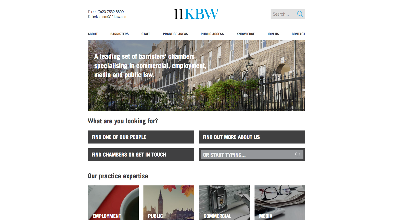
The 11KBW website uses a different style of layout to direct users through to key areas of the website. The panel under the heading allows users to be filtered through to either the profile pages, contact page or more information about the chambers. There is also a predictive search bar, which makes it easy to find information.
Like many of the other barristers’ chambers websites, there is a positioning statement in the main banner image, demonstrating the main areas of law they practice in and traditional imagery focused on the 11 Kings Bench Walk building.
16. Landmark Chambers
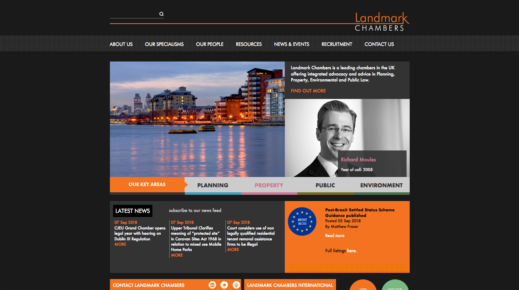
The Landmark Chambers homepage uses bright, rotating imagery which provides a nice contrast to the dark background. Below the short positioning statement is a panel which displays a selection of featured barristers names and profile photos which gives a small number of individuals good exposure in this prominent position.
Below this main panel, key practice areas are prioritised alongside the news content used to highlight recent cases. Overall, the design is simple with the brand colours helping to draw attention to key areas of content.
17. Maitland Chambers
 The Maitland Chambers website is focused on text, rather than imagery like many other chambers websites. The left and right side panels of the page highlight the latest news and recent cases. The centre panel offers a detailed introduction to the chamber, its size and areas of law they specialise in.
18. Monckton Chambers

The Monckton Chambers website homepage has a focus on the scrolling banner images and changing quotes. This then leads on to four panels which highlight the main areas of content on the website: Barristers, Practice Areas, Pupillage and the Brexit blog. News, Case and Event focused content is displayed further down the page.
19. Garden Court Chambers

A scrolling banner on the Garden Court Chambers homepage is used to highlight key information, including awards and the areas of law they specialise in. A prominently positioned panel to the right of the scrolling banner offers a short introduction to the chambers, their specialist expertise and links through to key practice area pages.
The bright supporting brand colours help lift the page content and draw attention to panels that highlight routes through to direct access and mediation content. Listed latest news and a Twitter feed make up the rest of the content on the homepage.
=20. St Philips Chambers
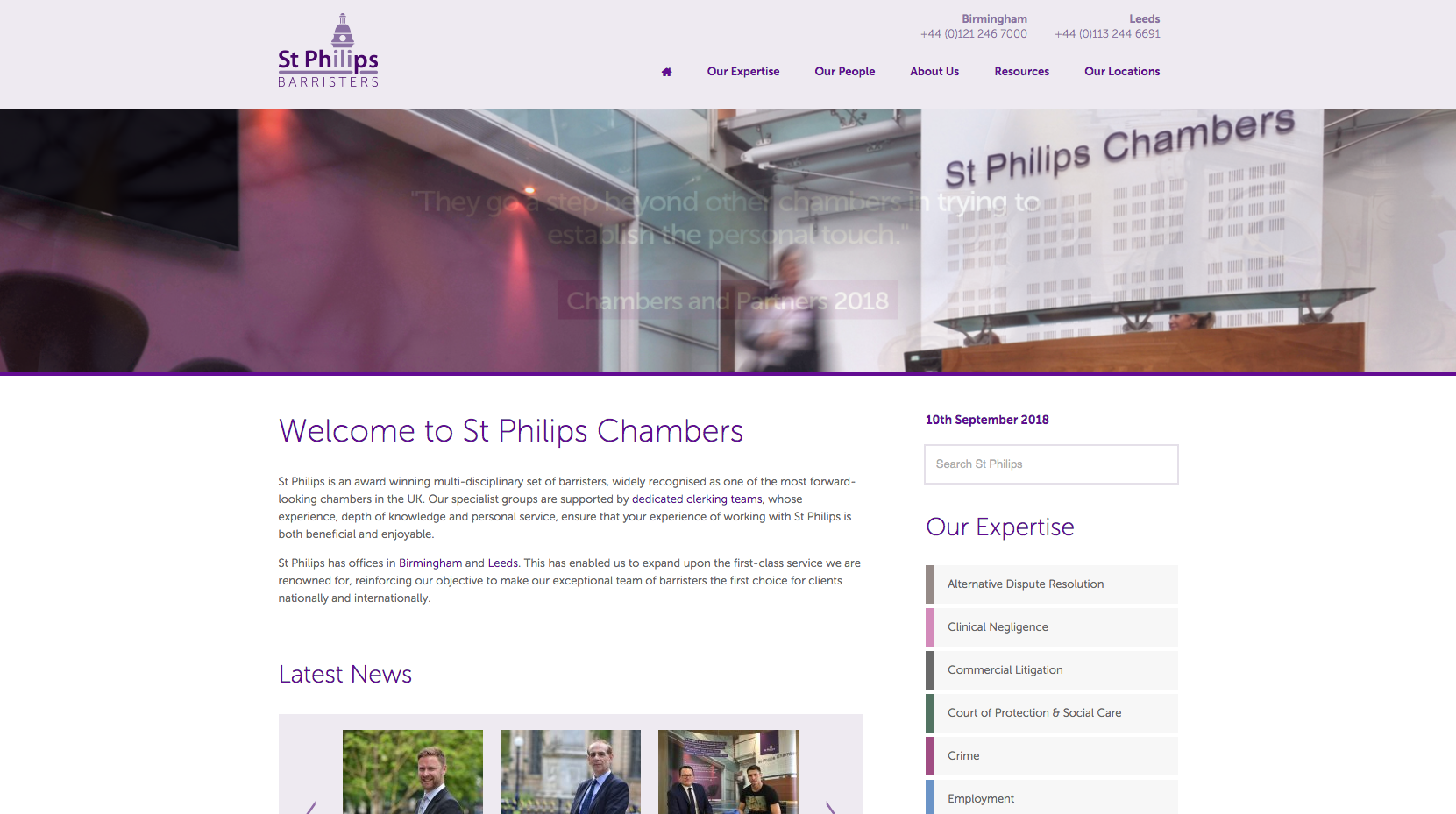
St Philips Chambers focus visitors on rotating directory quotes which are prominently positioned in the homepage banner area. The navigation panel has been kept simple with the five main areas of the website visible to access.
Under the banner, a large panel of text offers a welcome message and description of the chamber alongside a list of practice areas and scrolling latest news. A Direct Access call to action and Upcoming Seminar panel complete the content on the page.
=20. 3 Raymond Buildings

The 3RB website follows the same trend as many other chambers websites with half of the homepage filled with a large banner image and key areas of the website featured underneath. In this case, 3RB highlight their areas of Expertise, Contact Information and News content.
=22. Serjeants’ Inn Chambers
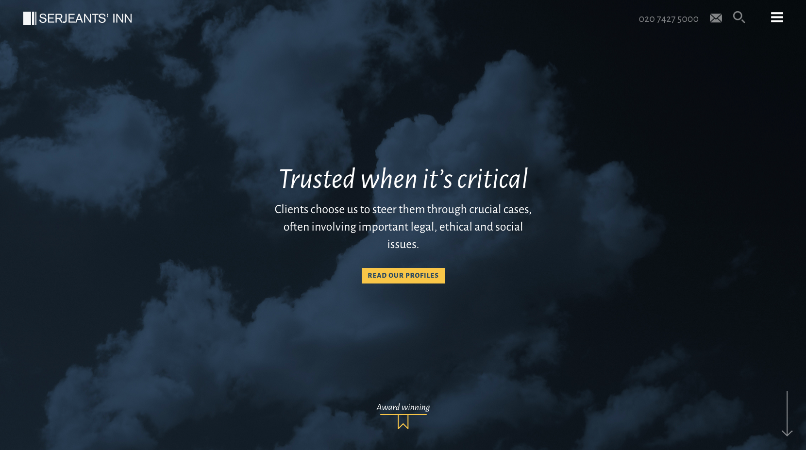
Serjeants’ Inn Chambers have chosen to focus on a brand positioning statement and a link through to barristers profiles which stands out of the page against the dark, atmospheric background image. An ‘Award winning’ tag draws the eye down the page and will encourage visitors to scroll, we well as displaying a positive message about the set.
Listed news content sits underneath the image which leads to a panel highlighting links to four specialist blogs. Moving further down the page, more positioning content and further awards information sit above a ‘Find a Barrister’ dropdown accordion which opens up to display links to each of the members’ profiles.
=22. Guildhall Chambers

The Guildhall Chambers website uses a dark colour scheme to bring out their branding colours. The dark panels make the main scrolling banner on the white background stand out while highlighting their directory quotes and individual barristers expertise. Drop down menus for Find a Barrister and the Practice Area page links are prioritised on the homepage to help drive traffic to these key areas of content.
Latest News, Next Seminar and Latest Article content sits above contact details and a panel encouraging visitors to subscribe to receive the latest news updates.
24. 4 Pump Court
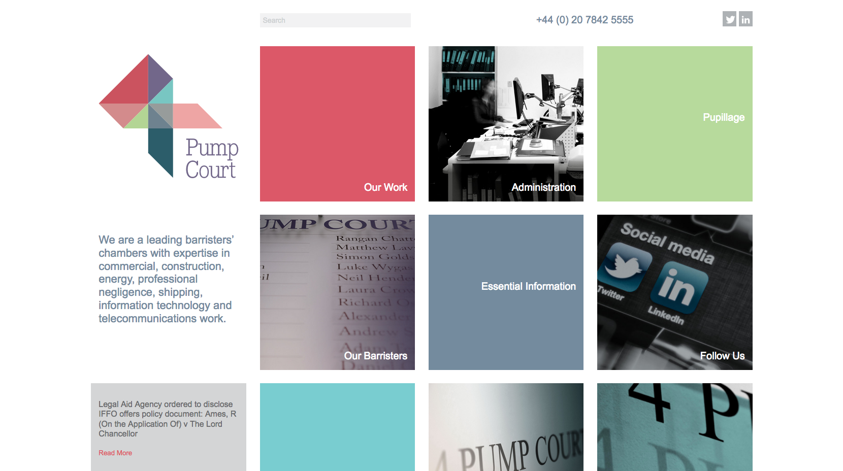
The 4 Pump Court website uses a grid style layout following the colour scheme in the logo. It is a different way to highlight key areas of the website without filling the homepage with lots of text. Social media is more prominently highlighted in comparison to a lot of other sets, with a ‘Follow Us’ call to action being one of the main focuses of the grid layout.
Under the logo on the left, there is a clear positioning statement emphasising the areas of law that they specialise in while the bottom left panel rotates through the latest news stories.
25. 7 King’s Bench Walk

7 King’s Bench walk has a simple website design with a purple colour scheme. The sliding homepage banner displays images of the chamber as well as recent awards. There is a clear priority given to the ‘Find a barrister’ content, that allows users to filter barristers by practice area in the drop-down or use the search bar below.
Areas of expertise are highlighted in a panel further down the page which sits on a purple background. This helps separate the information from the rest of the content, drawing the eye to the links and also towards a call to action which highlights the clerks’ contact details.
=26. Outer Temple Chambers

The Outer Temple homepage uses a number of different calls to action which are placed in prominent positions. The first is the ‘How can we help?” box, which filters different audiences through to areas of the website which will provide them with specific information regarding Legal Enquiries, Fees and General Enquiries.
Directory quotes build confidence while clear links to barrister profiles and legal services aim to drive traffic through to these key areas of content. The main banner features a subtle background video, rather than a static image, which give the page a dynamic feel. A simple news panel sits above a range of contact details which demonstrate the fact that Outer Temple have an international reach.
=26. XXIV Old Buildings

XXIV Old Buildings use an image-lead homepage with a striking banner image of a London skyline. The warm tones of the image tie in well with the brand colours and the rest of the website. Positioned in the banner image is a quote from Chambers & Partners which will help to build confidence with users visiting the website.
In the top right corner is the option to translate the website, which is a feature that most sets are yet to take advantage of when it comes to making their websites more accessible to international audiences.
28. Keating Chambers
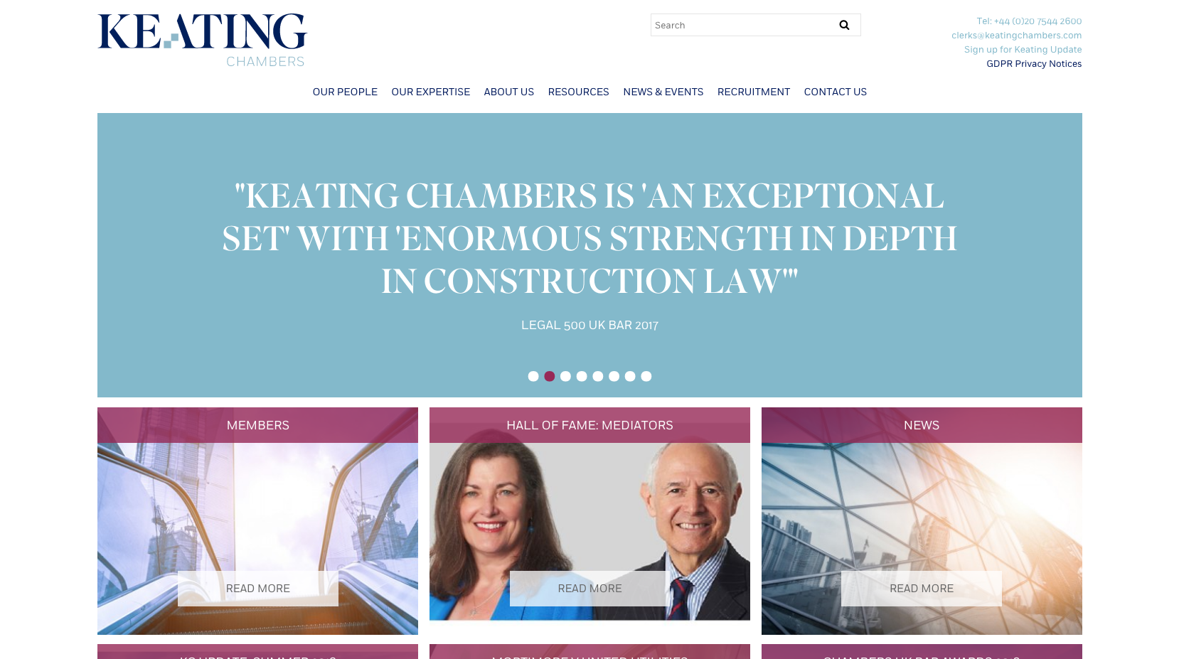
Keating Chambers dedicate the home page banner area to a series of rotating directory quotes and images which demonstrate international experience. The top right of the page displays information which is not as prominently positioned on most barristers chambers websites in the form of a ‘Sign up for Keating Updates’ and ‘GDPR Privacy Notices’.
The boxes displayed on the homepage direct users through to the members of chambers, mediators and news content with no mention of practice areas. The imagery works well to lift the page and draw attention to each of the panels.
29. Atkin Chambers
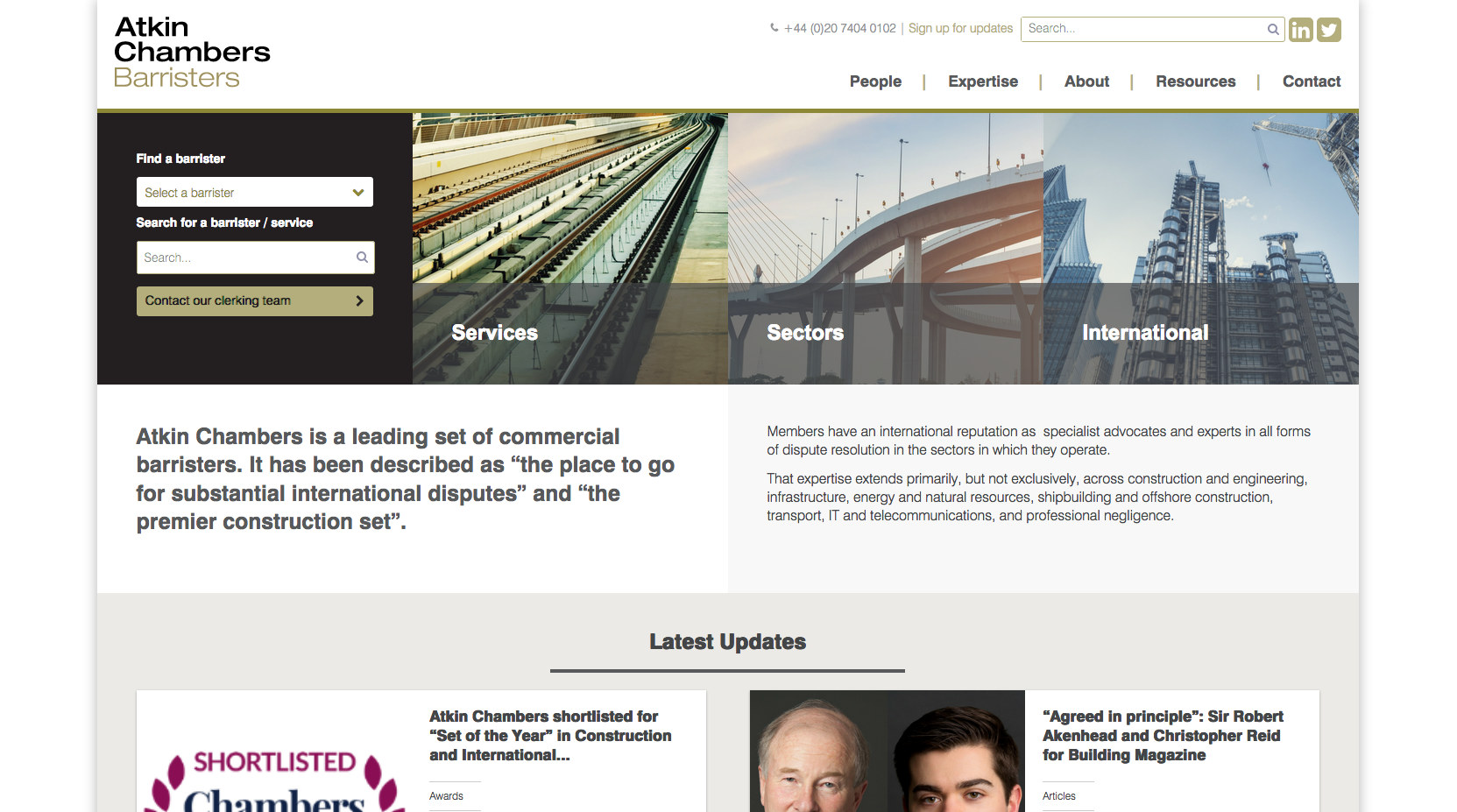
Atkin Chambers prominently position routes to key content including Services, Sectors and International content. The ‘Find a barrister’ panel allows users to filter down the search results by either selecting the barrister they want to view or filtering by expertise. A call to action to ‘Contact our clerking team’ is also positioned under the brand, ensuring that it is one of the first pieces of content viewed by visitors.
A positioning statement helps build confidence and position the chamber alongside content displaying latest news, recent cases and directory quotes.
30. 1 Crown Office Row
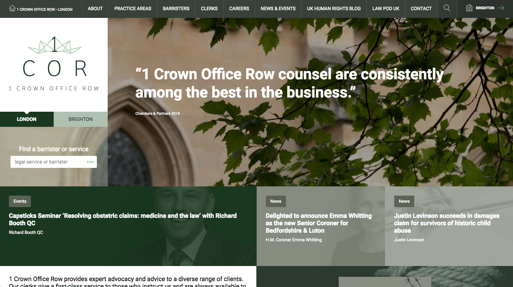
1COR have used a structured layout that allows easy access to London and Brighton specific areas of content. This makes the website easy to navigate by someone based in a specific location, searching for expertise provided by the chamber in a particular area of law.
The site uses a positioning statement which is featured in the banner space, alongside routes through to the practice areas and barristers profile pages. Latest news, events and a link through to a bespoke UK Human Rights blog demonstrate important publication based content, specialist knowledge and expertise.
31. Crown Office Chambers
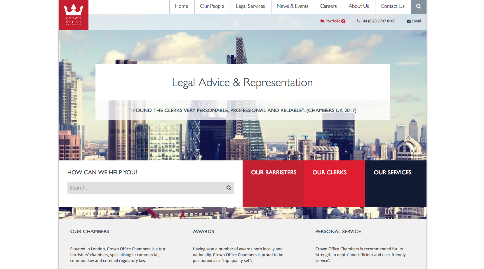
Crown Office have used a striking London cityscape image with a transparent strapline and rotating quotations from legal directories which help build confidence and a positive first impression. A prominently placed call to action asks above a search facility asks ‘How can we help you’ which is positioned search panel. The website offers clear direction through to the main areas of the site: Barristers, Clerks and Services, which have been highlighted in eye-catching panels using block colours from the brand palette.
Moving down the page Crown Office Chambers offer visitors an overview of their services alongside content which highlights success in the form of Awards and a panel which helps make the chamber appear approachable by offering visitors a Personal Service. Featured News, Events and a Twitter feed display a variety of latest news towards the bottom of the page.
32. Exchange Chambers

Exchange Chambers used a simple homepage design, with a clear focus on the main banner image. It ties in well with the branding colours and overall design, maintaining simplicity for users. As you scroll down the page, boxes pop up to direct users through to key areas of content.
33. South Square

The South Square website is clearly focused on pushing users through to barrister profile pages. Each of the barristers’ profile images are displayed on the homepage with a short description of their specialisms.
Along the top of the homepage is a descriptive positioning statement, allowing visitors to understand the areas of law South Square specialise in. Above this is a simple navigation panel to direct users through to other key areas of the website.
34. 4 Stone Buildings
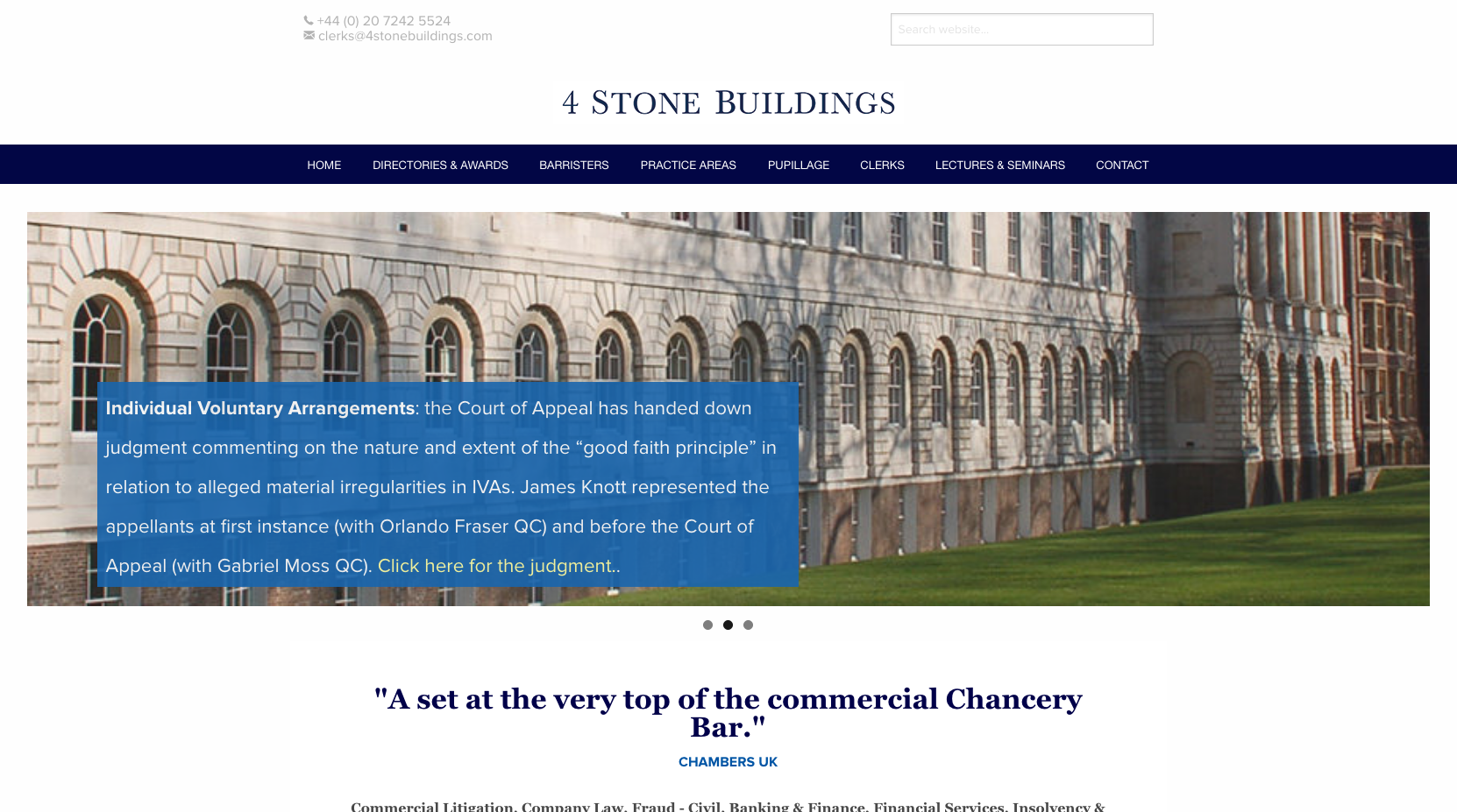
4 Stone Buildings have used a straightforward website design. The homepage is fairly short, displaying a couple of recent news items in the scrolling banner text, and a directory quote below. The brand sits below a prominently positioned telephone number and search panel which will help visitors get in touch or find more specific areas of content early on in their journey.
=35. Radcliffe Chambers

Radcliffe Chambers use a dark colour scheme on their website which follows their branding colours. The scrolling banner images feature words picked out from various directory quotes. Under the banner area is a small tab which allows visitors to view the latest news and a list of barristers, which gives priority to this content on the homepage.
=35. St John’s Chambers
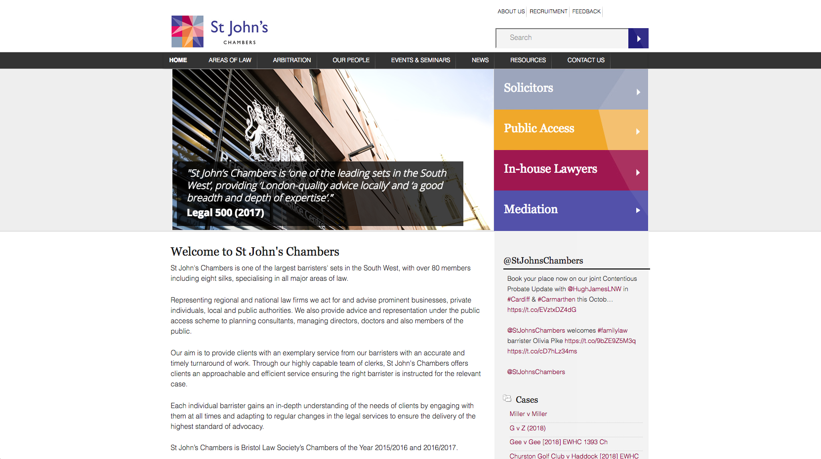
The St John’s Chambers website has clear calls to action through which direct the different audience types through to different areas of the website. The homepage makes good use of the branding colours to highlight important content while further down the page, a statement describes the chamber and their areas of expertise.
37. 20 Essex Street
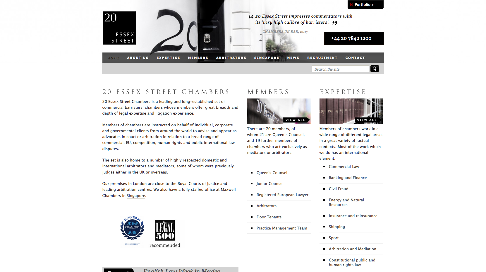
20 Essex Street have used a banner image with rotating directory quotes at the top of their non-mobile responsive homepage. Visitors are presented with a prominently positioned telephone number which is highlighted in the banner image, encouraging visitors to make contact. Under the navigation panel sits a statement describing the chambers and offering an insight into the type of work they complete. Links through to members with differing levels of experience and a list of expertise pages sit above a latest news item which completes the page.
38. Quadrant Chambers

Quadrant Chambers have chosen to deploy a different structure on their homepage design. The page used a minimalist style with a main sliding banner highlighting a positioning statement and directory quotes.
Four calls to action follow underneath the banner, which directs visitors through to the main areas of the website. The site also uses a hidden navigation panel which helps to keep the layout of the page very clean.
39. 2TG – 2 Temple Gardens

2TG use a large image on their home page which makes good use of incorporating the brand colours in the design. Directory quotes position the set in the top right of the image.
The navigation panel has been designed to be clean and simple while to the right of the page, 2TG have made use of sticky social links, which follow the page as a visitor scrolls, to direct users through to social media channels.
=40. Old Square Chambers
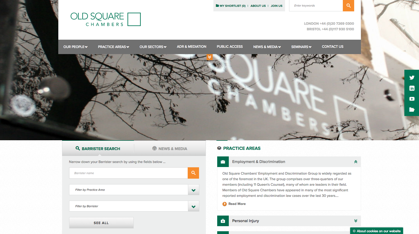
Old Square Chambers have used a lot of content on their homepage which directs visitors through to many different places on the website. There is an option to complete a Barrister search through a facility on the left-hand side or navigate directly through to news content. There is also an option for visitors to view the individual practice areas if they would like to read more information about the areas of law Old Square specialise in.
=40. 2 Hare Court

2 Hare Court use a striking image of London with a short statement which positions them as a leading set. The navigation panel along the top of the page follows a different structure in that the logo is displayed in the centre of the page which breaks up the navigation links.
Visitors are encouraged to navigate down the homepage by a moving arrow which leads into a live barrister search facility and push-points leading to Direct Access and Licenced Access areas of the website. The brand colours work well on a light background to draw attention to key content, calls to action and news items.
=40. 2 Bedford Row
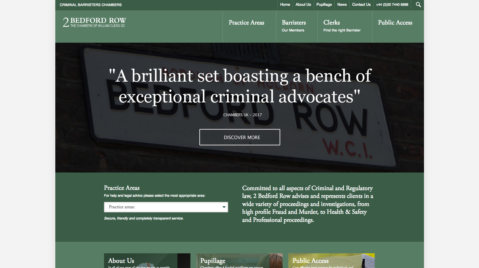
2 Bedford Row use a banner image with prominent sliding directory quotes which help position the chamber as a leading set in criminal law. The navigation panel at the top of the page focuses on the content most people arrive at a chambers website wishing to view: Practice Areas, Barristers, Clerks and Public Access.
Visitors are given the ability to quickly access the different practice areas from a drop-down panel which helps keep the home page design clean. A short positioning statement offers a little more description about the work 2 Bedford Row complete before push points containing images and links draw the eye towards Pupillage and again, Public Access focused content.
Recent case and listed news content sit above two blog articles which demonstrate a variety of recent publication based content produced by the chamber.
43. QEB Hollis Whiteman

QEB Hollis Whiteman have employed a modern design to their website. Featuring a graphic style image on their homepage, the large sliding quotes and logo fit well when overlayed with the design. The top-level navigation is kept clean with different drop-down drawers to display access to further areas of content.
Links to deeper levels of practice area content, a positioning statement, publication based content and a Find a Barrister feature make up the rest of the content on the home page.
44. Enterprise Chambers
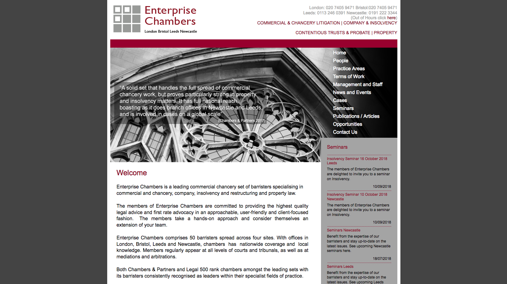
The Enterprise Chambers website homepage contains a lot of text. It features a large statement giving further information about the chambers and their specialisms, while also displaying messaging and directory quotes over the top of a banner image. The navigation panel runs down the right-hand side, rather along the top of the page while the top level navigation offers access to the main areas of expertise.
45. Cornerstone Barristers
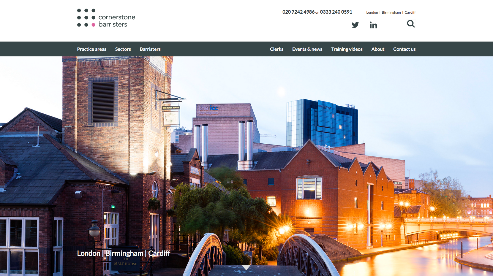
Cornerstone Barristers keep the initial homepage view simple, with a sliding banner displaying London, Birmingham and Cardiff focused imagery, to represent each of the sets regional locations. The top navigation panel is split into two sections, one justified to the left and the other to the right of the page. To the left, visitors are directed to the three areas of the website which will historically receive the most traffic (Practice areas, Sectors and Barristers). The right side navigation allows visitors to navigate through to the more generic pages such as the About and Contact pages.
The rest of the home page allows visitors to scroll through a lot of content, including directory logos, a large banner which links to the barristers’ profiles, directory quotes, seminars and latest news. The Publications content scrolls to display book covers which gives the panel a dynamic feel.
46. 6KBW College Hill
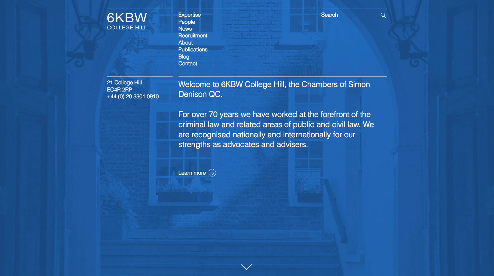
6KBW College Hill have tried a different format for their website homepage. The top-level navigation features a list of pages rather than displaying them horizontally along the top of the page. A large welcome message is displayed under the navigation which establishes the chamber as experts in criminal, public and civil law.
The four column layout of the navigation panel allows subpages to be displayed in the third column as you click through the website which acts as a style of breadcrumb trail navigation for visitors. The home page also displays two latest news articles and three featured barristers, with an option to click through to the barristers’ listings page.
47. Devereux Chambers
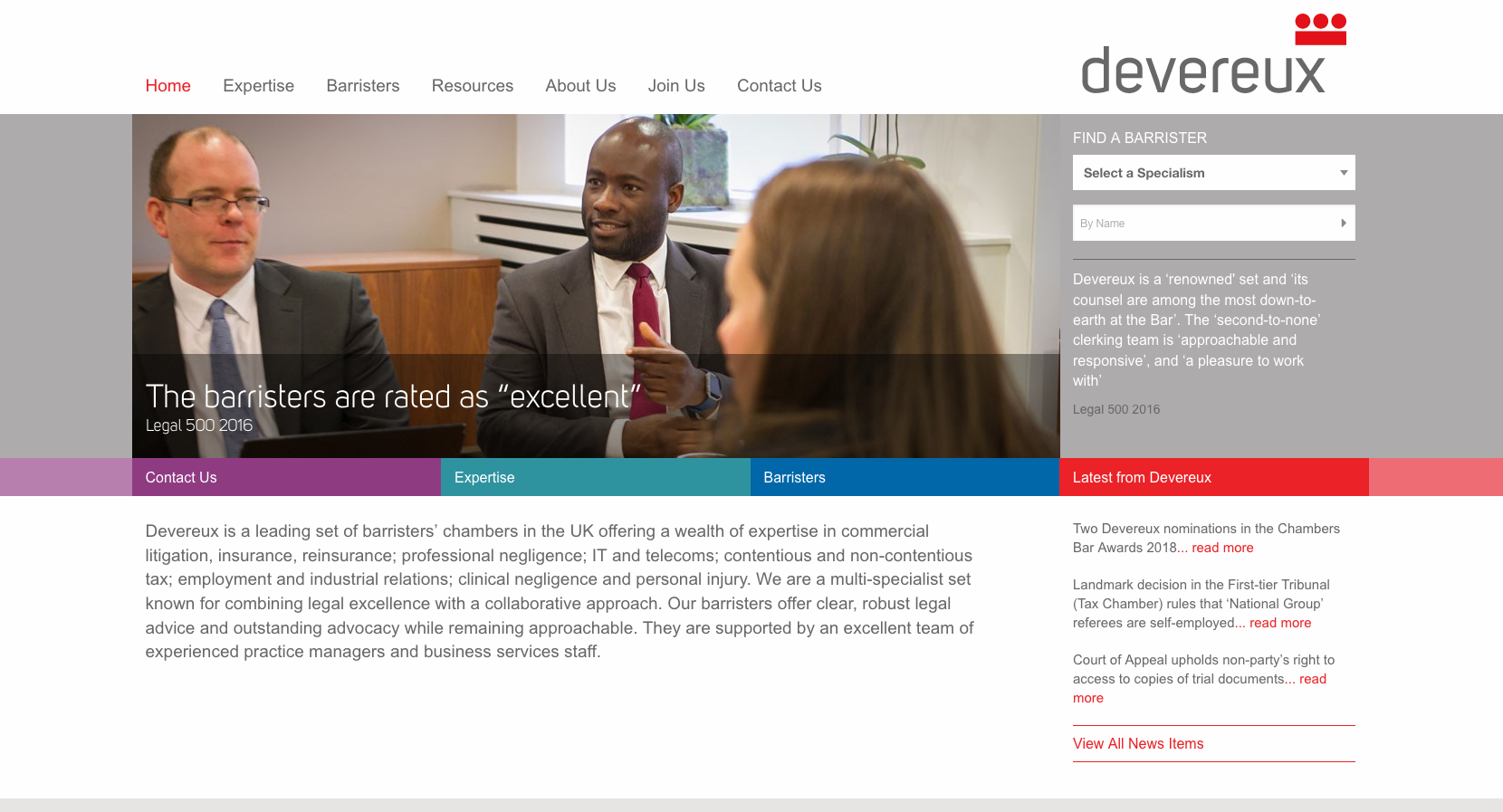
Devereux Chambers use a large paragraph of text which gives an overview of the organisation, highlighting experience in key practice areas. To the right side of the page, visitors can navigate through to the barrister content by filtering barristers by their areas of expertise or searching for an individual by name.
Key areas of content are highlighted below this panel in the different branding colours, including a latest news area which displays three articles.
48. 5 Stone Buildings

5 Stone Buildings have taken a slightly different approach to their homepage design by choosing to use colours overlaying a textured photograph of stone. The layout works well to draw attention to both the main search bar which allows visitors to search for a barrister, and the list of practice area pages which are listed below.
The top-level navigation facility is kept simple while a separate panel at the top of the page features links to social media profiles, the ability to shortlist barristers, a search facility an telephone number. A positioning statement and two panels displaying a single news item and a newsletter sign-up complete the page.
=49. Francis Taylor Building
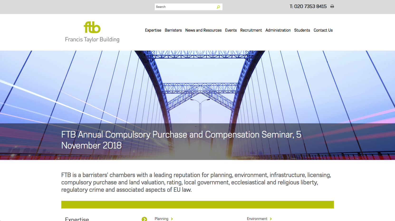
Francis Taylor Building have used the main sliding banner area to highlight important content while a subtle search bar is positioned in the centre of the page, above the navigation panel. Supporting branding colours of orange and blue are used to highlight links through to the barristers’ profiles and latest news articles which sit under an Expertise panel which lists links to the main practice area pages.
A large panel towards the bottom of the page displays a range of latest news and events alongside a Twitter feed which helps communicate a range of latest activity from the chamber.
=49. Erskine Chambers

The focus of the Erskine Chambers homepage is on striking imagery in the form of a sliding banner. The rotating messaging, which offers a positioning statement and directory quotes, sits underneath. Their navigation panel which is centred at the top of the page is concise, allowing visitors to focus on five main areas of content.
Moving down the homepage, the site uses a series of coloured blocks which highlight the main practice areas while the news panel highlights six articles in panels which use images with colour overlays to draw attention.

